A Midcentury Collector Home Gets a Very Modern Push into Tomorrow
I
n 2006, Remco and Andrea got a Rummer for Christmas. The couple, young parents working as designers in Amsterdam, were called by their employer (a certain sportswear company) to relocate across the ocean to be closer to its Oregon HQ. A world away, physically and culturally, they struggled to find a home around Beaverton that appealed to the clean-lined minimalism they’d grown used to in the Netherlands: Remco is from there, and Andrea worked in Amsterdam for years.
“Portland Modern wasn’t necessarily an established thing yet, but they had a newsletter,” says Remco, referring to the local real estate company. “I got their newsletter and I saw a picture of this house.”
“And he was like, ‘Andrea, this is it,’” his wife says. They weren’t yet familiar with Portland’s famed midcentury developer Robert Rummer, “The Rummer Network,” or the plaque that’s hung on card-carrying members’ homes. But the modest size and tidy lines reminded them of European living. They bought the house without having set foot in it, only catching their first in-person glimpse the morning of December 25, fresh off an international flight, plucked from the middle of Amsterdam and dropped into an Oregon suburb.
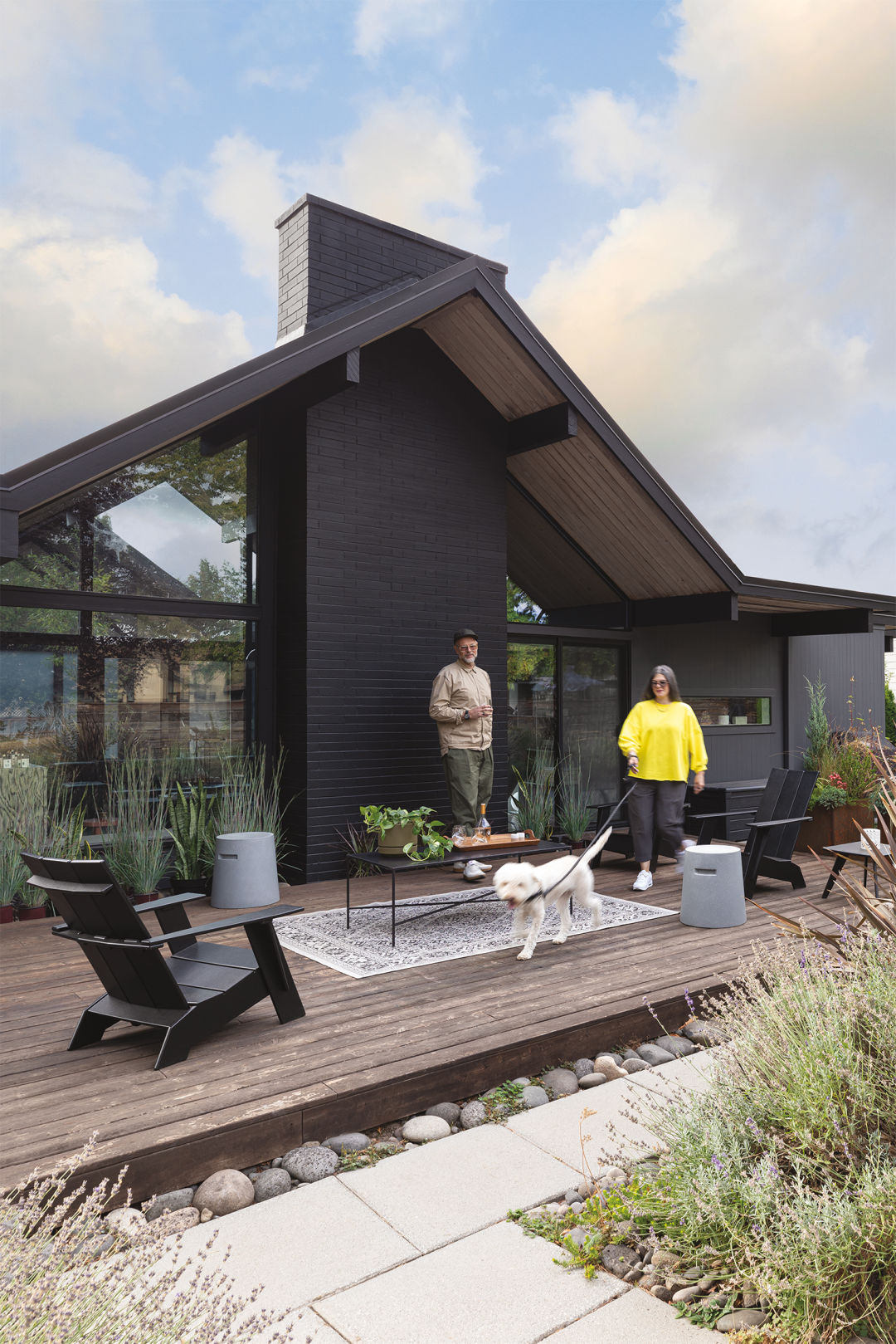
The owners on the back deck
Image: Christopher Dibble
Rummer, who’s 95 and lives in Woodburn, built roughly 750 of his trademark post and beam homes around Portland in the ’60s and ’70s. Flat roofs with sharp-pitched gables and large windows (you can see through the house, front to back) are markers of Rummer designs, but most immediately recognizable are the central atriums. The inside-as-outside, plant-filled boxes (along with those flat roofs) tell of where Rummer got his inspiration: California. More specifically, from Joseph Eichler, the iconic developer behind that state’s ubiquitous midcentury tract-style subdivisions. The two even consulted some of the same architects; looking at blueprints side by side, it’s hard to tell one from the other.
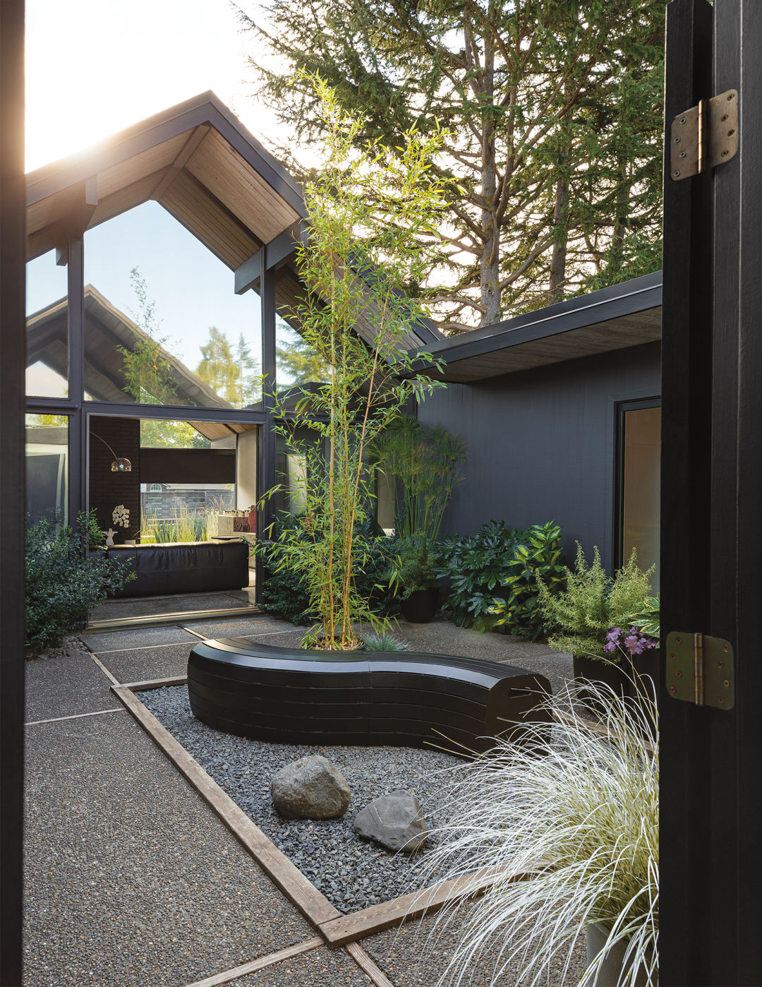
The atrium
Image: Christopher Dibble
Rummers didn’t come onto the market back then with the same status they hold today. “They were affordable housing, let’s put it that way,” says Remco, referring to a low-budget construction that explains some of their wear and tear. When she spoke with Rummer himself, Andrea says, he asked for the code marked on the house’s floor plan: GB-276, he told her, refers to an original listing price of $27,600. Rummers average upward of $1,000,000 today, which creates a bit of a paradox for their owners: keeping the cult-classic houses just as they are is not sustainable, but updating them too drastically could spoil their magic.
G
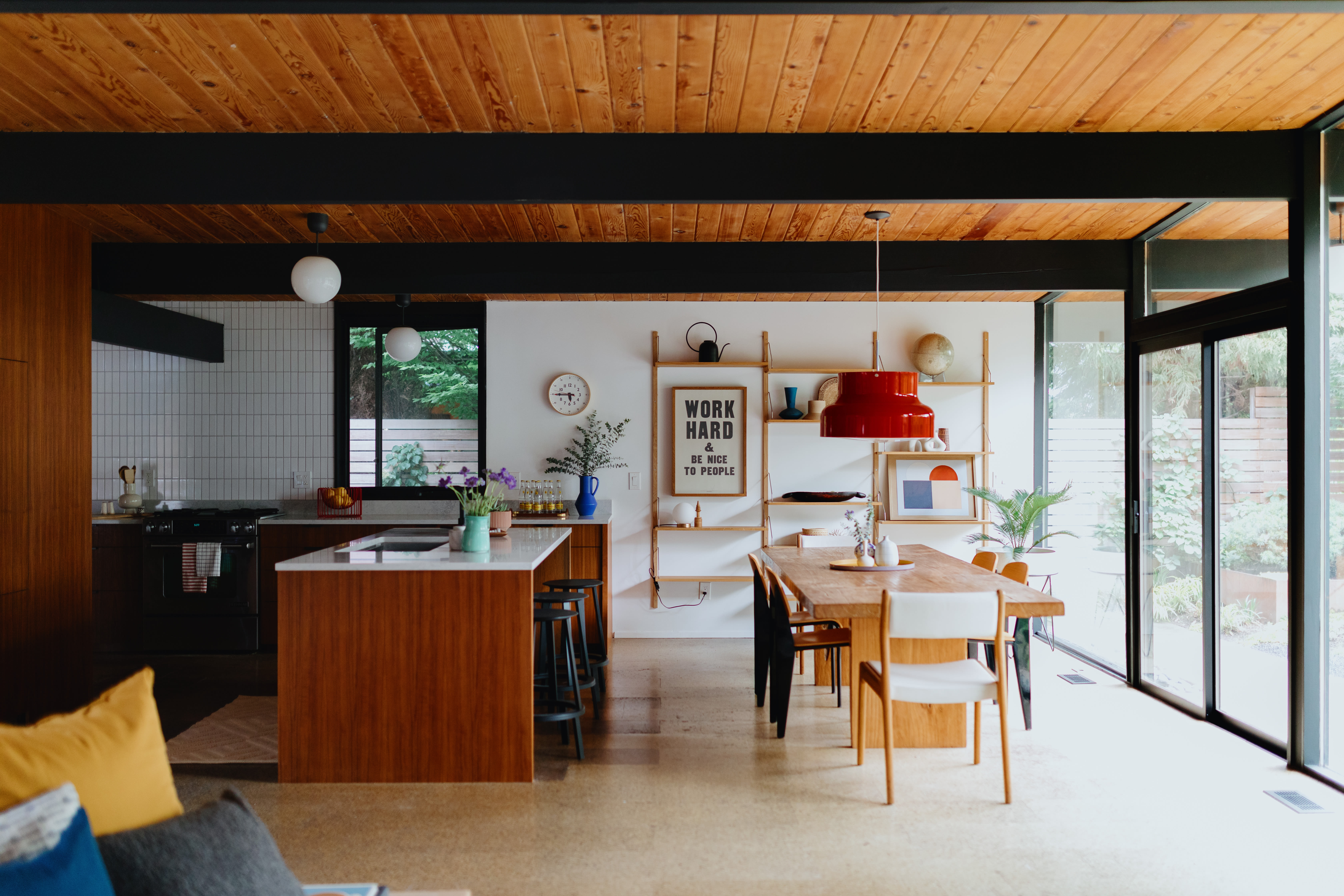
enerally speaking, these midcentury designs are revered for their restrained, open-concept floor plans, a photogenic feature that brings challenges when it comes to containing children (and their stuff).
“Two years ago, we said, ‘Let’s invest in this house so we can live here another 15 years,’” says Remco. After years of going outside to access the garage and months of taking COVID-forced Zoom calls in the undivided kitchen, living, and office space, the couple decided to do something bordering on sacrilege: shift the layout for extra closet space, modernize the kitchen, and literally build a wall in the middle of the open main space.
They turned to friend and former colleague Stewart Horner, of the interior design firm Penny Black. “We’re probably really tough to work with, being design people,” says Andrea. They didn’t want Horner to simply execute their vision; as designers respecting one another, they wanted him to push their ideas and bring his own.
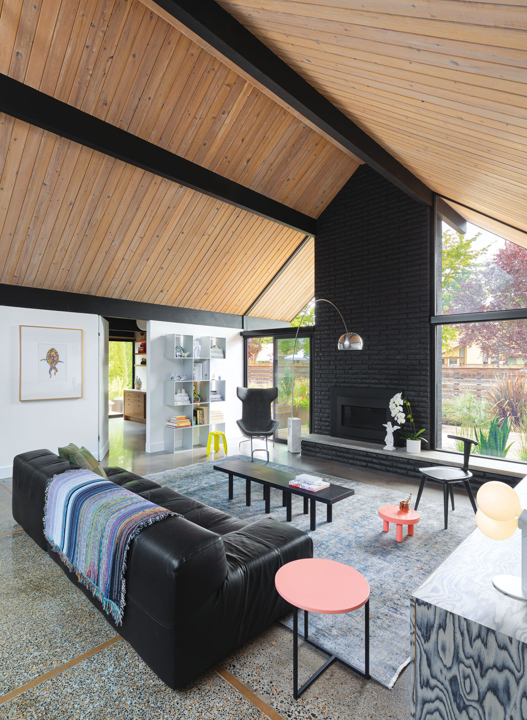
A new wall and door break the Rummer rules by separating the living space from the office and kitchen, counter to the original plan
Image: Christopher Dibble
A lot made it into the remodel they wouldn’t have gone for on their own, says Remco. Horner says their trust really allowed him to grow a full vision for the space, instead of the string of compromises that remodels can sometimes amount to, especially when a home has historical significance. “Not to discredit keeping with the age and everything midcentury, but that’s why I was excited to work with these guys—that wasn’t really the focus,” says Horner.
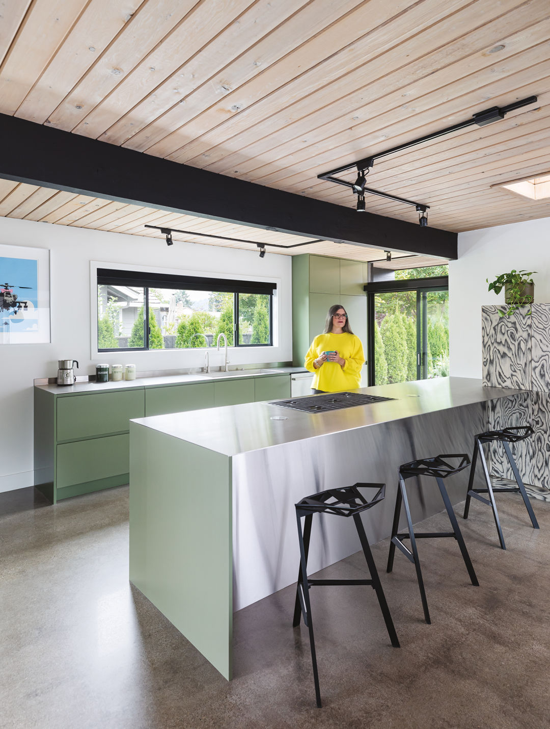
The homeowners liked the kitchen’s layout but wanted to rework its feel; subdued green cabinets without exposed hardware replaced a dated Ikea set, and generously sized stainless-steel counters brought a futuristic, crisp edge. The controversial wall is painted a stark white and divides the kitchen and living rooms to section off the new home office. With its unbroken façade (due to a hidden door handle and hinges) there’s nothing midcentury about it.
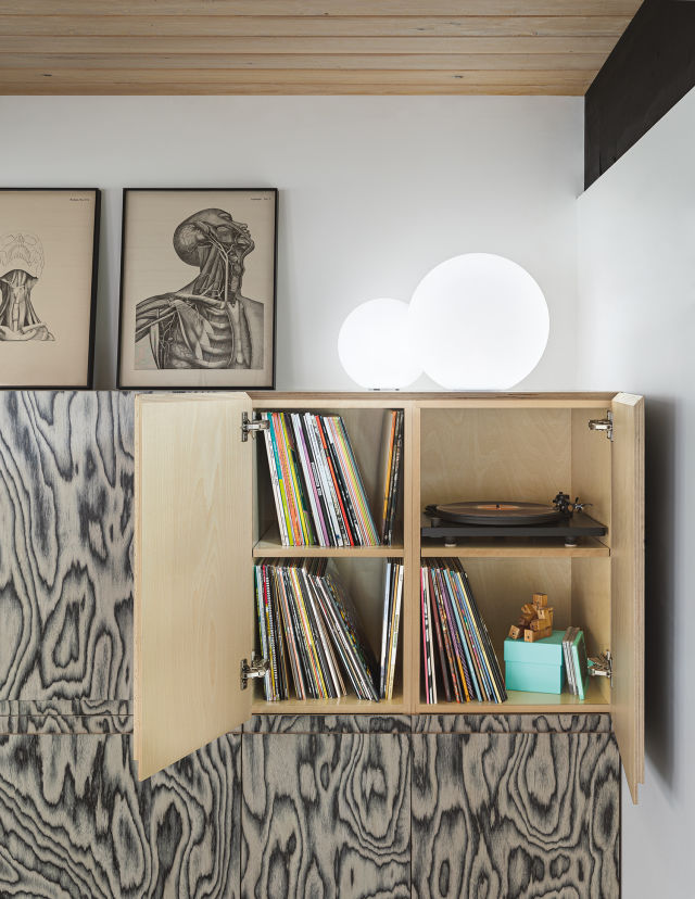
A veneer on the living room console is repeated in the kitchen, which has pop-up outlets in the countertop.
Image: Christopher Dibble
Despite closing off some of the space, the single-level home still feels very open. A few design choices consistent throughout the single-level house carry you from one room to the next. The floors— once an acid-stained concrete whose green patina, Horner says, unflatteringly presented as camouflage—have been ground down, creating a sleek, polished surface. White-washed wood ceilings run throughout the house and extend past the walls to the gutters, drawing the eye from one room to the next and contrasting nicely with the dark beams that loom over the space and match the house’s dark gray exterior.

Remco sits with Rossi, the family’s Lagotto Romagnolo, in the office.
Image: Christopher Dibble
Normally, a big furniture swap to complete the new aesthetic is part of a remodel, but the couple’s existing collection actually influenced the more permanent design aspects of the house. “Maybe it looks like a bit of a furniture store at times, but it’s our interpretation and our collection—how we take a house from the ’60s and make it feel like us,” says Andrea.
“The architecture is something we look at, and we listen to it, but the same design ethos is at play with a lot of the furniture that these guys are into,” says Horner.
A veneer on the living room console is repeated in the kitchen,
Image: Christopher Dibble
The built-ins that line the kitchen and serve as a console in the living room are a case study. The cabinets are finished with a patterned veneer from famed ’80s Milan design studio the Memphis Group. Ettor Sottsass, the studio’s founder, used the high-contrast pattern as an accent in his art deco–inspired furniture. Horner expanded the design to cover large planes of the house, making for a clever, if-you-know-you-know nod to a design-industry titan. From afar, the pattern looks loud, like an abstract painting stretched across the cabinets, but reveals itself the closer you get as a subtly enhanced woodgrain. The result is a modernist play on an exposed wood cabinet, emphasizing the modern in midcentury modern. “We wouldn’t have done that,” Remco says, crediting the influence of Horner.
For all high-design touches and historical significance, the house is far from intimidating. It feels like somewhere you could really live: special, but never precious. We imagine this Christmas will be a bit more comfortable than the family’s first here.
Design School
A cherry-picked list of trendsetting designer furniture new and old
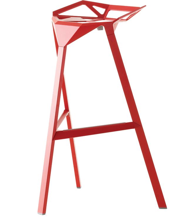
Image: Magis Designs
Stool One by Magis Designer Konstantin Grcic set out to make the most stool with the least amount of material. What he came up with were these wild, three-legged stools that are shockingly comfortable despite looking like they were designed circa the year 3000.
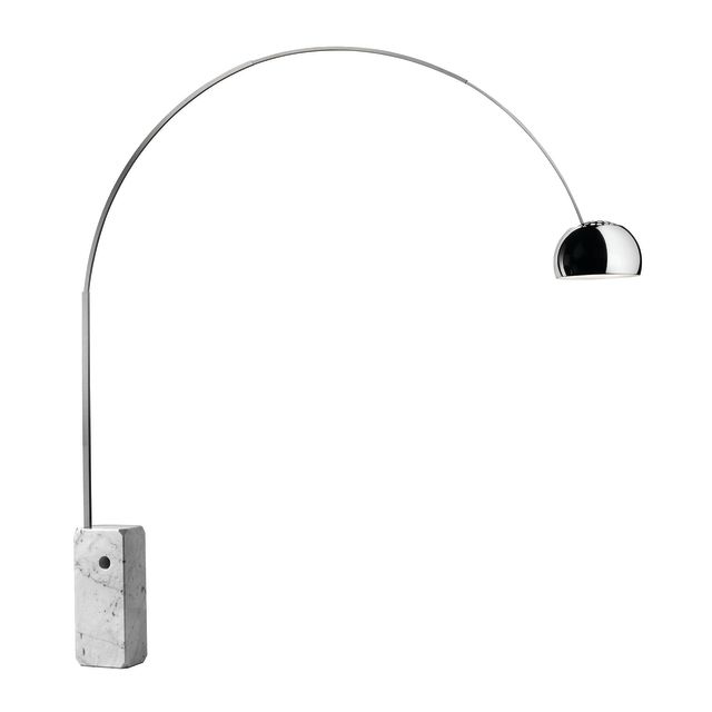
Image: Flos
Arco floor lamp by Flos This
is the floor lamp that set off the ubiquitous lamp slung over the couch like a willow tree trend. A midcentury living room is practically incomplete without one. In 1962, designers Achille and Pier Giacomo Castiglioni named streetlamps as their inspiration.

Image: Moroso
‘Take a line for a walk’
armchair by Moroso Designer Alfredo Häberli named this chair for the famous line from artist and Bauhaus instructor Paul Klee that drawing is simply taking a line for a walk.
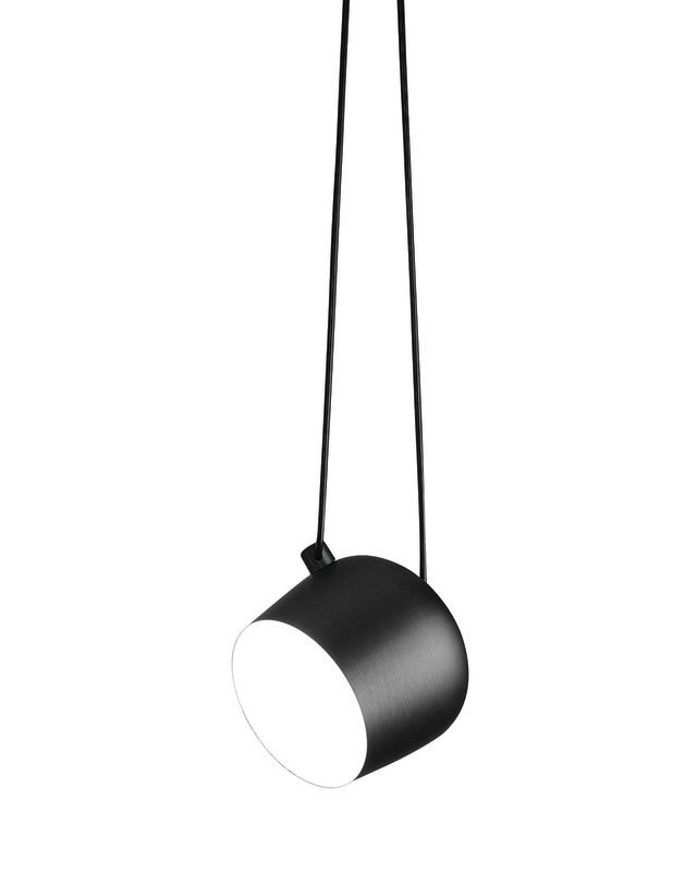
Image: Flos
Aim pendants by Flos
Designers and brothers Ronan and Erwan Bouroullec set out to make a pared-back fixture that lets you make your own design out of the tangle of understated wires and lights, essentially functioning as the classiest twinkly lights on the market.

INTERNATIONAL TRAVEL
An Insider Guide to Amsterdam

Dining Picks