Less Was More When It Came To The Look Of Batman: The Animated Series
30 years after "Batman: The Animated Series" first debuted, we're still celebrating its massive contribution to the legacy of the Dark Knight. At this point, it's well-documented how the show redefined the character for an entire generation with its brooding tone, top-notch voice talent, and serious treatment of Batman and the rogues gallery. But before any of that could be established, co-creators Bruce Timm and Eric Radomski had come up with a comprehensive vision for the show.
Having worked for Warner Bros. Animation on "Tiny Toon Adventures," the pair were ready to branch out, and eager to produce something that was as unlike their previous project as possible. As Timm says in Vulture's oral history of the show, Warner was looking to try their hand at a new animated Batman series and he jumped at the opportunity. Once Radomski was brought onboard, it was time for the pair to develop a proof of concept for the show in the form of a short Batman animation. It was here that the now legendary style that came to define the show was developed. And while a lot went into sculpting that style, the key to its success was actually simplicity.
The Dark Deco style of Batman: The Animated Series
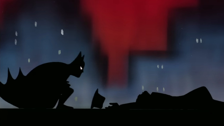
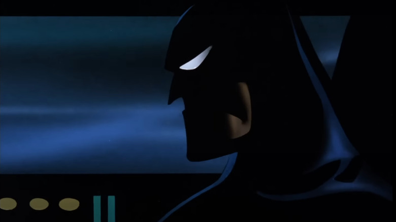
During development for "Batman: The Animated Series," Bruce Timm coined the term "Dark Deco." It was a neat way to describe the decidedly grim yet elegant tone that both he and Radomski were intent on maintaining for their vision of the Dark Knight — combining, as it does, the show's Art Deco influence with a shadow-heavy style borrowed from German expressionism and film noir. As Timm described it in the retrospective documentary "The Heart of Batman":
"Dark Deco is a term I came up with on the spur of the moment once, just because it's combining two different things. The dark look of the show was something that Eric and I were both really into trying to achieve. We both wanted to bring kind of an old-timey film noir kind of sensibility to the visuals ... and the Deco aspect of it just came from basically just from me being a fan of architecture of that era."
The result of this Dark Deco sensibility was a Gotham city that, much like Tim Burton's vision of the iconic city in "Batman" and "Batman Returns," felt strangely timeless. The Art Deco elements brought to mind the 1920s, while many of the show's visual elements such as the black and white TVs and even the character designs themselves evoked that particular decade. Meanwhile, Batman and his array of gadgets provided "Batman: The Animated Series" futuristic elements, rounding out a potentially disorienting collection of influences that had the practical effect of lending the show a surreal sense of belonging to every era and to none.
Simple, not simplistic
By this point, the show was set to combine a dizzying array of influences which could have easily felt too incongruous sitting side-by-side. Thankfully, Timm knew the key to making sure that didn't happen was in using a uniformly simple animation style, which it turns out was exactly what he and Radomski had intended from the very beginning. As the co-creator recalls it:
"I had worked on a bunch of action-adventure shows for TV before, and every single one of them, I thought, was overdesigned ... On 'G.I. Joe,' especially, it wasn't enough just to draw a belt on a character, the belt had seams and buttons and snaps and pockets. There's no good reason to draw every shoelace on a shoe. Just make it a simple shape."
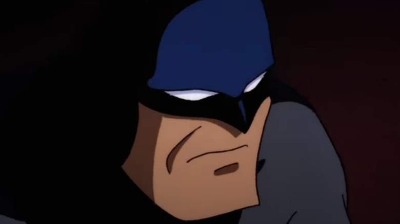
Along with Radomski, Timm set out to simplify the design language of the characters and props in their show and "just boil everything down to its essential ingredient." Taking cues from the Max Fleischer Superman cartoons, the characters in "Batman: The Animated Series" maintained a minimalist style that initially prompted pushback from people who had seen Timm and Radomski's proto-pilot and would ask if the pair were going to "make the show look more detailed" when it finally aired. But Timm and his co-creator knew they were on to something with their simple style and pushed ahead — in retrospect, a pretty remarkable moment of prescience from two guys who really hadn't worked on anything like this before.
Drawing out of the darkness
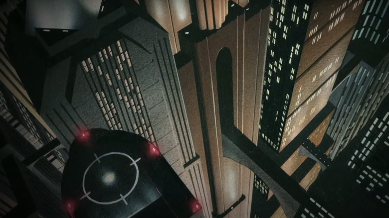
With simplicity as their guiding design principle, Timm and Radomski had found a way to combine their numerous influences into a show that still maintained a certain uniformity and accessibility, despite having a dark sensibilities that were unorthodox in animation at the time. That commitment to keeping things simple extended to Gotham City itself, with Radomski recalling how he knew he was going to struggle with painting Gotham City "over and over and over again." Rather than painting the copious shadows required when rendering Batman's home-town, Radomski used black card and drew the light of Gotham's environments directly onto it, utilizing the already existing darkness of the card for the shadows. As Executive Producer Tom Ruegger put it: "you're not pulling drawings out of the light, you're pulling the drawing out of the darkness, which is of course where Batman lives."
Aside from being another simple but effective technique, it's yet another example of the innovation that came from "Batman: The Animated Series," and all of this was before the show's now classic storylines were written or Kevin Conroy had stepped anywhere near a vocal booth. Of course, both Timm and Radomski had been influenced by Tim Burton's darker take on Batman, but they had truly pushed things beyond Burton's vision to create their own, truly unique version of the character's universe. So unique was it, that there hasn't really been anything like it since, which seems a real shame as the enduring popularity and charm of Timm and Radomski's cartoon is surely an argument for letting creators try new things in bringing a comprehensive vision to the screen. Someone should at least tell David Zaslav to rethink axing "Batman: Caped Crusader," the follow-up to "Batman: The Animated Series" which Timm himself was involved in.


