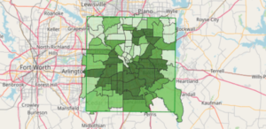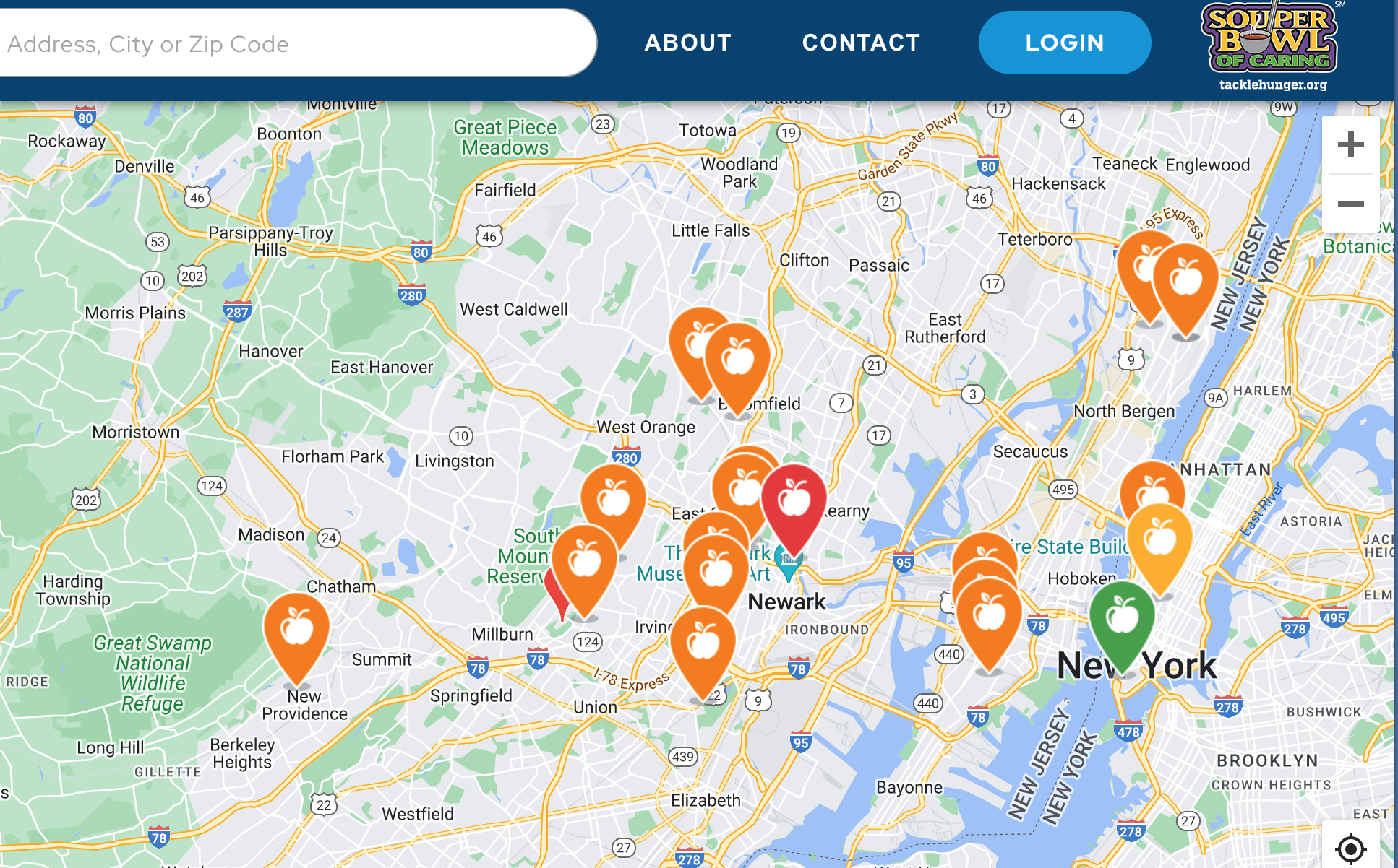
A color-coded map is helping food pantries across the nation get the food aid they need when they need it.
Souper Bowl of Caring launched the Tackle Hunger Map at the beginning of the pandemic as a way to show the “real-time need” of food charities across the United States. The map lets charities log their inventory, so donors around the country know which pantries have the highest and lowest need.
Besides generating donations, the Tackle Hunger Map addresses a conundrum of hunger relief: that food aid often occurs in an inequitable way. Pantries in better-resourced communities are more likely to have easier access to food donations and monetary assistance, compared to those in poorer communities.
The federal government’s desire during the pandemic to better pinpoint the nation’s overall need for food aid led to the creation of the map, said Alison Reese, Executive Director of Souper Bowl of Caring, a nationwide fundraising platform that generates contributions to local food charities.

Equipped with its knowledge of the nationwide range of food charities, Souper Bowl of Caring compiled the map and partnered with the Joint Artificial Intelligence Center division of the Department of Defense to fine-tune the data, and find hunger hotspots around the United States.“We started because of a question that came from the Department of Defense,” Reese said. “Ever since we developed that, we have been working with them. We share data with them, so that they can see that data and understand a little bit more of the system.”
Of the 23,000 food charities on the map, roughly 30% update their need on the map when Souper Bowl of Caring emails to remind them. Around 12,000 more charities will be added to the map this month, and Reese estimates that nearly 30,000 charities will be on the map by the end of June after the data is deduplicated.
When participating charities update their status on the map, they select one of three colors: green for adequate stock, orange for high need and red for extremely high need. “It’s as accurate as the charity wants it to be,” Reese said.
Over time, the data can help identify patterns in food need. “If we can get all the charities to update then we have a better sense for what happened over the course of a year or two,” Reese said. “Consequently, entities that could help, say federal programs or state programs, could pinpoint times of the year that it’s going to be trickier and more important to support it.”
The Tackle Hunger Map gives donors the option to donate to the charity of their choice directly through the map, or they can donate to Souper Bowl of Caring and a check will be sent to the charity within 30 days.
In addition to outside donations, Reese has seen “green” charities aid “orange” and “red” charities through the map. “Our food charities are helping one another because if they see a charity turned red, they can then say, ‘Oh, maybe I can call and see what they need, maybe our pantry can help support those needs,’ but so could a local church or a local group who is interested in making sure that that community is flourishing. So there are all sorts of opportunities,” Reese said.
The Fairfield Community Food Bank, based in Winnsboro, S.C., exemplifies the type of community connections and support the Tackle Hunger Map can foster. Executive Director Wendy Luce said her charity came across the map because a local church had offered to match donations to the pantry made through Souper Bowl of Caring, prompting Luce to look up Souper Bowl of Caring and its Tackle Hunger Map.
From there, attaining a spot on the map was easy — all Luce had to do was create a login, select a color to represent her charity’s need and wait for donations to come in. “As we’re learning and working for next year, we’re going to try to approach various organizations and see if they will adopt us and do a fundraiser for us through the Tackle Hunger Map,” Luce said.
Another notable example of support via the map was an unexpected $25,000 donation made to West Valley Community Services in Sunnyvale, Calif., Reese said. Donations are not guaranteed to charities on the map, she said, but when users make donations, the opportunity arises for charities to network within their community.
“Because they’re on the map means that they have the ability to get donations and they have no idea when that one’s going to come in,” Reese said. “These charities can develop a support network that includes all different kinds of groups in their area and those groups may not have known that they were there. The only way they knew is because they looked at this map.”
Reese’s overall goal for the map is to raise awareness of its existence. Growing with a small budget, the Tackle Hunger Map heavily relies on grassroot support, according to Reese.
“[We’re] trying to fundraise and grow the awareness of the map so more people are able to use it to make some better decisions about where there are problems with hunger around our country, where there are holes in the system,” she said. – Adrianna Pray
Adrianna Pray is a first-year journalism student at Emerson College. In addition to Food Bank News, she writes for Emerson College’s student-run newspaper, The Berkeley Beacon.
CAPTION ABOVE: The Tackle Hunger map of the New York City area shows pantries with red, orange and green levels of need.
Like what you’re reading?
Support Food Bank NewsConnect with Us: