Ina Garten Chose a Subtle Paint Color for Her Kitchen—Here’s the Reason It Makes Sense

Updated: Dec. 22, 2023

"If the room is like bright red, then you're aware of the room, you're not aware of what's in it," Ina said. Her kitchen design puts the focus back on food.
For fans of the Food Network, Ina Garten is no stranger. The Barefoot Contessa whips up delicious recipes with a warm demeanor that makes us believe we can cook just like her. I mean, come on—have you tried her Boston Cream Pie or Crab Nachos?
If you’ve ever looked carefully at her kitchen, though, you know the design isn’t all that flashy. That’s for good reason. Here’s what Ina was thinking when she designed her space.
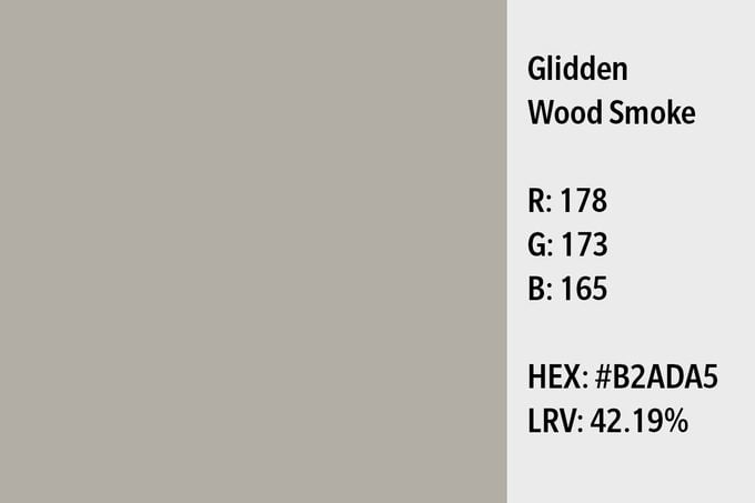
What Color Is Ina Garten’s Kitchen?
When designing her kitchen, Ina thought that the color of the walls was as important as the design itself. “Most people start with the design of something, but I want to know what color the room’s going to be first,” she said in a House Beautiful interview back in 2009.
Instead of bright colors, or even an all-white kitchen with a bright pop of color, Ina prefers a more neutral tone. In the same interview, Ina said, “For a kitchen, because you’re dealing with very brightly colored things, I want something that’s a great foil for the colors of the fruits and vegetables.”
Ina chose a “taupe-y gray” color for her kitchen’s walls—Glidden’s Wood Smoke. It followed her basic principle for kitchen design: neutral colors help your food pop even more.
See what kitchen trends are on the way out.
Does It Fit Your Style?
If a kitchen refresh is in your near future, then choosing neutral colors for the walls may be exactly what you need. Ina also mentioned that dark countertops help bowls and utensils look great as you use them. You could even install dark cabinets to provide depth in an otherwise neutral space. We hope the Barefoot Contessa would approve!
Originally Published: January 27, 2022