
The stock market has reached extremes several times during its long journey upward. And it has made a mockery of those who attempt to predict when it has reached a peak or valley. Still, it's hard not to see the parallels with one euphoric period of the recent past.
That's why investors need to be prepared if the stock market crashes this year. To that end, there are a few charts that investors should keep in mind when trying to navigate the current investment landscape.

Image source: Getty Images.
Breakthrough to bust
From January 1998 to March 2000, the Nasdaq Biotechnology Index rose 436%. It would lose more than two-thirds of that gain over the next 16 months. That climb was fueled by the belief that sequencing the human genome would open up a new branch of medicine. That journey took years -- some might say decades -- and a lot of money. When the market crashed, investors decided they weren't willing to wait.

Data source: S&P Capital IQ. Chart by author.
In the past few years, gene-based medicine has burst onto the scene as the next medical breakthrough. The excitement -- and funding -- have been magnified by a global pandemic. The success of COVID-19 vaccines using messenger RNA (mRNA), as well as clinical breakthroughs using gene-editing technology CRISPR -- clustered regularly interspaced short palindromic repeats -- have spurred another impressive run.
The University of Florida's Jay Ritter, who tracks initial public offerings, has noted that 77 biotechs went public in 2020 and 96 in 2021. Both set records. And many aim to profit from huge markets in the future. The promise hasn't been lost on Wall Street.
From the lows in March 2020, that same biotechnology index climbed more than 80% by this past August. Those gains have been cut in half since.
In a few decades, investors will no doubt look back at a trailblazer like Intellia Therapeutics (NTLA 1.21%) or a disruptor like Moderna (NASDAQ: MRNA) and marvel at the long-term returns. But it's impossible to say for sure which companies will produce the biggest returns. And one look at the chart from the turn of the century should remind investors that the journey can be quite painful even for the winners.
The bigger they are...
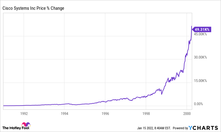
A trip back in history is also a great lesson for those who think the stock returns over the past few years have no parallel. They do. From its 1993 IPO through the end of the decade, JDS Uniphase climbed almost 29,000%. America Online began trading in 1992 and rose more than 70,000% by the end of 1999. But the darling of the era was Cisco Systems (CSCO -0.37%). From its 1990 IPO through March 2000, shares rose more than 103,000%.
Tesla (TSLA -3.40%) is the darling of the stock market these days, and it's no wonder. The stock has risen almost 23,000% since 2012. A chart of its stock price would fit in with the biggest winners of the dot-com era. Similar to Cisco, the chart has gone vertical in the last two years of its massive run.

It is important to note that as Cisco shares fell 65% over the subsequent seven years -- they were 88% off the high at one point -- the business continued to grow. In fact, revenue more than doubled and earnings per share more than tripled. The culprit was the valuation. What investors were willing to pay per dollar of sales collapsed almost 90% over that span.

CSCO PS Ratio data by YCharts
Of course, no one knows what the future holds for Tesla -- the company or its shareholders. But the chart above shows that the performance of the business may not protect an investment if the market crashes, at least not in the short term. That brings us to the most important chart of all.
Time in the market
Since 1980, the S&P 500 Index has dropped at least 18% seven times. That means that, on average, about every six years investors experience something close to the definition of a bear market. Yet over that period, someone buying and holding realized a 4,220% gain. Enduring the volatility turned a mere $10,000 into $432,000.

The natural question to ask is, "What if I could avoid those drops?" Actually, Charles Schwab modeled a portfolio that did just that. They found that investing in the S&P 500 Index at the lowest closing point of every year for 20 years outperformed someone who simply invested the same amount on the first trading day of those years. That's not surprising. What is surprising is that the perfect market timer only grew their portfolio by about 12% more.
Perfectly timing the market didn't actually pay off that much. Many will make the argument that the result would be very different applying the math to an individual stock. But that would require extreme luck and would be hard to distinguish from gambling. And investing is not supposed to feel like gambling.
So if a market crash does arrive in 2022, remember that the shares of companies can become disconnected from the business performance. They can fall a lot further than most can imagine. Yet, the stock market has always recovered its losses, usually in short order. Investing is rarely easy. But using the past for perspective might help keep things in perspective.


