These Could Be Some Of The Most Popular Paint Colors In 2022
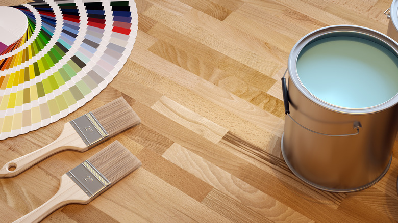
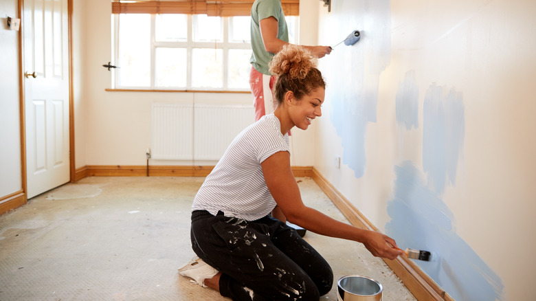
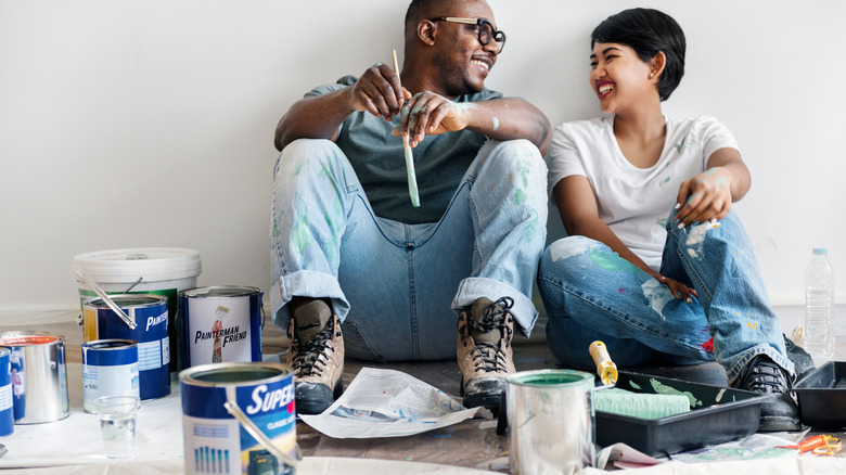
To spruce up your home quickly and affordably, it's hard to go wrong with a new lick of paint. Creating a brand-new color scheme throughout your home can give your spaces a brand-new lease on life without breaking the bank, and all of that amounts to big business for paint-makers. In 2019, the U.S. paint and coatings market came in valued at well over $24 billion, and with that projected to rise in the coming years, 2022 will be a big year for paint, according to Grand View Research.
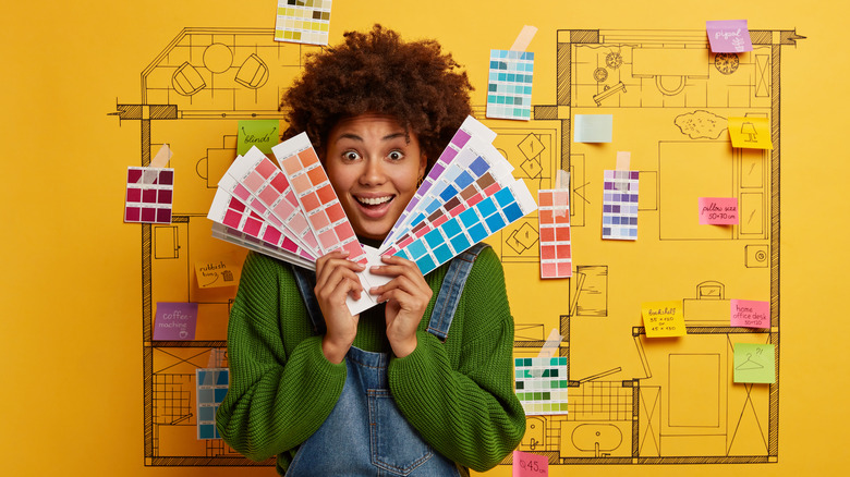
For 2022, paint manufacturers and interior designers alike are all about embracing the new, according to Sherwin-Williams' director of color marketing Sue Wadden. She told Martha Stewart that while in previous years, "we were focused on comfort, and the idea of our homes being a sanctuary," for 2022, it's all about "sustainability, rebirth, and growth." And what better way to usher in a fresh start than with some of the hottest colors out there for the year? In this article, let's look at some of our top picks for paint colors in 2022.
For natural color, Very Peri might be the choice for you
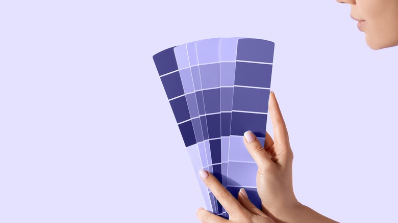
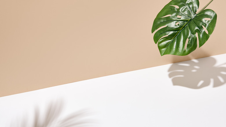
It's pretty fair to say that Pantone knows what people want from paint shades as a company. So we can say with fair confidence that Pantone's color of the year for 2022, Very Peri, is one we're going to be seeing a lot of. This deep shade of periwinkle can imbue your walls with a sense of natural tranquility, evoking images of lavender-filled fields and a definite feeling of luxury. Vibrant yet subtle in tone, Very Peri and other shades of periwinkle work very well contrasted with neutral tones and white ceilings, SFGate suggests.
According to Pantone's executive director Leatrice Eiseman, periwinkle isn't just in vogue when it comes to paint. Eiseman told Adweek that when Pantone is selecting their color of the year, they "have our finger on the pulse of what we call the zeitgeist ... We also look at the entertainment world. There are colors in those films that people are beginning to get immersed in. Consumers would start to see some of these colors and say, 'Look at what they use in that character's sweater — I'd love to have that color." Well, now, folks, you can. That periwinkle sweater you saw in that film? It can be all over your walls!
Greens like Evergreen Fog are in
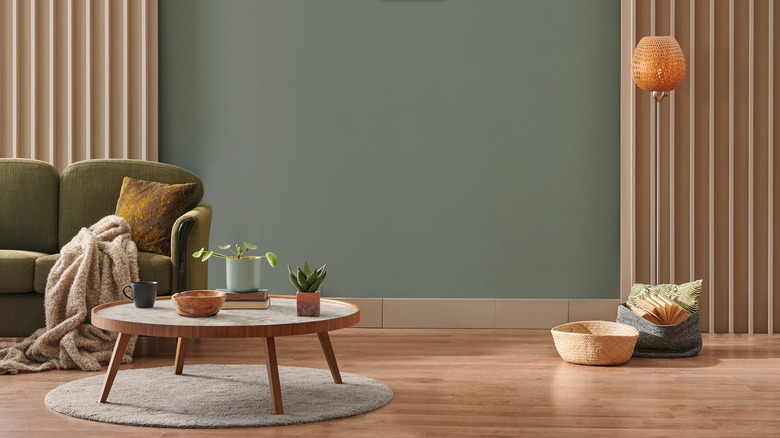
The evocatively-named Evergreen Fog, made by Sherwin-Williams, will be a heavy hitter in 2022. A stately gray-green, the shade was picked as Sherwin-Williams' color of the year for 2022, per House Beautiful. The company's director of color marketing, Sue Wadden, described it as "a sophisticated wash of color for spaces that crave a subtle yet stunning statement shade." We like the sound of that.
True to the hopes of many for 2022 to offer a fresh start, "Evergreen Fog inspires us to begin again and is a great choice for modern interiors and exteriors," says Wadden. Evergreen Fog and other gray-green hues are a classy choice for a range of interiors and work particularly well contrasted against neutral furnishings and fixtures. As at home in a bathroom as it is in the front space, a gray-green hue also works with golden tones and is complemented by other, brighter shades of green. To create a simultaneous feeling of contrast and cohesion, you could also try offsetting Evergreen Fog against patterned wallpapers containing gray or green hues.
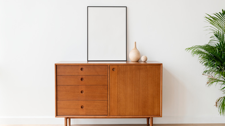
Don't underestimate neutrals like Neutral Territory
"Warm neutral paint colors are having a moment," Nicole Gibbons, the founder of paint company Clare, told Elle Decor. Although 2022 looks to be a year where bold colors are popular, likely, neutral tones like creams and eggshells will also be everywhere. That's because "a neutral paint palette can instantly make a room feel cozy and comforting," as well as allow a space to remain flexible to an array of decorative choices.
For this reason, Gibbons recommends Neutral Territory, a natural sandy beige made by Clare, as a hot pick for 2022. Containing warm undertones, this shade meshes well with neutral tones and bolder color choices alike. Likely, we won't only be seeing lighter-shaded neutrals this year since people are beginning to lean towards darker, earthier colors to give their spaces a sense of richness. WGSN's head of interiors, Gemma Riberti, suggested to Elle Decor that clay and terra-cotta shades could also be big hitters in 2022 as part of a more nuanced move towards neutrals.
For a feeling of fresh air, choose Breathe
Now, isn't that a comforting name for a paint color? We're pretty confident that Breathe, Graham & Brown's color of the year for 2022, has a little more going for it than just serene-sounding branding. This shade of tranquil mid-blue strikes a balance between light and dark, making it a versatile color that positively exudes a sense of calm and peace.
The subtly rich blue is all part of a move towards a "reconnection with nature" for 2022, Graham & Brown's Chief Executive Officer Andrew Graham told House Beautiful. It pairs perfectly with lighter wood tones and natural shades of green. It also goes very well with bright neutrals like light grays and whites. Breathe and other mid-hue blues are also excellent choices to be used for color drenching, which is painting your walls, ceilings, and fixtures in the same shade to create what Abby Hesketh, Graham & Brown's Wallpaper & Paint Product Manager, calls a "seamless feel." You can even match your furnishings with the wall shades to emphasize the effect of calm uniformity.
Sage tones, like October Mist, will be in for 2022
With 2022's emphasis on feelings of renewal and nature, it's a safe bet to say that shades of green are going to rule the roost. Paint supremo Benjamin Moore shows no signs of bucking that trend with its 2022 color of the year, which is October Mist, per House Beautiful. According to the company's director of color marketing & development, Andrea Magno, "October Mist 1495 and the corresponding Color Trends 2022 palette reflects an effortless harmony of colors while inspiring unique combinations for any paint project."
This subtle shade of sage bridges the gap between color and neutral, delivering a sense of brightness and acting ably as a base for more vivid contrasting tones, furnishings, or accessories. Benjamin Moore's 2022 palette follows a similar theme, with other subtle shades of green and pink remaining useful for neutral purposes while also imbuing spaces with a sense of vigor. This keeps with the year's general movement color-wise towards a fresh start and new beginnings.
For bright color lovers, 2022 will be big on pinks like Orchid Flower
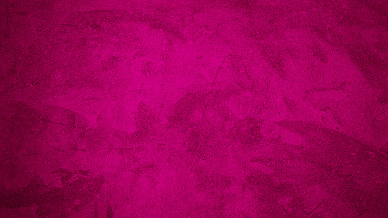
Let's face it, we all want a bit of color in our lives. So if you're looking forward to a new paint job, you're in luck. Bright, vibrant shades of pinks and purples are due to be everywhere in 2022. This is probably why trend forecasting company WGSN has named Orchid Flower as its 2022 color of the year, which is a rich shade of saturated magenta that positively screams life and optimism, per House Beautiful.
A shade that's as at home in autumn as it is in the spring, WGSN states that "this saturated magenta tone creates a sense of positivity and escapism and embodies the dopamine brights trend that has been peaking across industries." In other words, pinks will not just be on walls in 2022. You will also see them in the fashion world. As Apartment Therapy shows, magenta tones look great with other bold decoration choices –- go big or go home, folks. Having said that, vivid pinks and purples also work very well with neutral floorings and features, and can also be used as a statement wall in an otherwise neutral room.
Sea greens like Breezeway will make a splash
There's a strong sense of the ocean permeating paint colors in 2022, with consumers increasingly leaning towards tones that evoke the sensation of being by the water and outside in nature. This is especially apparent in Behr's color pick of the year, Breezeway. A sea glass green, Breezeway "inspires us to fully embrace the hobbies or adventures, both near and far, that excite us," Behr's vice president of color and creative services Erika Woelfel told Southern Living. It acts as a color "that welcomes a hopeful sense of renewal, restoration, and healing."
Sounds nice, doesn't it? Light sea greens, as well as other pastel-adjacent green tones, are hugely versatile and are at home pretty much anywhere in your home. Try styling them against bright white fixtures and furnishings to make your front room feel as airy and expansive as the beach, or offset Breezeway against blacks and golds in a kitchen or bathroom to create a sense of luxury. Light sea greens are also an easy fit with wooden tones, which further helps flush out that 2022 "nature" theme.
In 2022, new earth tones like Art and Craft will be popular
2022 looks to be the year that classic color tones are married with new ideas, which is embodied quite clearly in Dunn Edwards' pick of 2022, Art and Craft. This brown shade, which can take on qualities of dusty pink in certain lights, marries a classic sense of nature with a forward-thinking eye.
Art and Craft's emerging popularity for 2022 is all part of a resurgence of brown shades in a year that looks towards embracing the natural world in new and innovative ways. As comfortable on the exterior of your home as it would be in your living space or dining room, brown tones naturally pair very well with brighter neutrals and fit in nicely next to natural textures like stone or wood. Equally, in a space dominated by brighter colors, brown tones can give a feeling of depth and grounding, offering a visual feast for the eye and preventing your rooms from feeling too clinical.
Lighter blues like Bright Skies will rule the roost
We all want to look forward to brighter skies, and so it's only natural that a paint color called Bright Skies would be a popular choice for 2022. And that's precisely what paint giant Dulux is banking on when naming the blue shade their color of the year, according to Ideal Home. Creative Director of Dulux U.K. Marianne Shillingford justified the growing trend towards blues by explaining that "right now, people want to feel revitalized and enjoy the freedoms that are returning to them, to look out and bring in new ideas. What better inspiration can we take than the endless skies around us?"
Blue tones are the ideal choice for interiors for 2022 for their ability to offer a feeling of calmness and connection with the outdoors in your very own home. Offices and bedrooms are particularly ideal for blue hues, which imbue them with a sense of serenity. While lighter blues naturally work very well with bright neutrals, pairing them with deeper color tones or contrasting greens can accentuate them. And, true to form, the best place for Bright Skies might even be on your ceiling, where you can recreate the peaceful feeling that an all-blue sky gives you while you're hunched over your laptop on your fourth coffee of the day. (No? Just us? Okay then!)
Watch out for midnight blues like Goodnight Moon
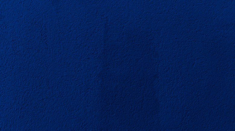
Although lighter blues look like they'll be very popular for 2022, you shouldn't discount the fact that deeper, richer blues may also be popping up everywhere you look. As part of a broader movement towards bigger, bolder color statements for the year, we expect midnight blues to be a strong presence in 2022. This is something that paint company Clare's founder Nicole Gibbons also agrees with, particularly for certain rooms. "Shades of blue are going to be the go-to for dining rooms for those who want to stay away from neutral paint tones in this room," she told Elle Decor. More specifically, Gibbons identifies Clare's shade Goodnight Moon as a popular choice, stating that the color "is dark and alluring and the perfect saturated tone for a dramatic dining area."
This move towards bold blues for 2022 is also predicted by WGSN's head of interiors Gemma Riberti, who suggests that midtone blues could be a recurring color this year. According to Riberti, mid-blues work well with "naturals or other midtones with a reassuring simplicity yet positivity that resonates well with consumers." So watch out for these shades taking over.
For 2022, cool blues like Aleutian could be everywhere
Paints that can do more than one thing seem to be the way forward for 2022, with shades that balance one main color with an undertone of another looking to be this year's big stars. HGTV Home by Sherwin-Williams certainly seems to agree. PR Newswire reported that the paint brand picked Aleutian as their color for 2022. A cool blue balanced by undertones of red, this shade works effortlessly as a foundation to any room's decor.
HGTV Home by Sherwin-Williams' wider color palette, in fact, seems to fall in line with Aleutian's ability to juggle multiple tones. It features a range of paints that imbue bold colors with more neutral underpinnings. The collection, titled Softened Refuge, speaks volumes with its name alone. It has a selection of colors created to promote mental and physical wellness and match various aesthetics. If you're looking for a wholesome color to give your home new life, there are worse places to start than these.
For a classic feel, go for School House White
A set of white walls might seem like a pretty uninspired option, but the reality is, premium shades of white never go out of style. So it's not much of a surprise that for 2022 we can expect to see statement whites make the rounds on people's walls. Luxe paint company Farrow & Ball certainly seems to think so, too, with its selection of School House White as one of its top color picks for 2022, per House Beautiful. A gentle off-white, this shade can pair well with pretty much anything you throw at it, from splashes of colors to an almost infinite range of fixtures.
If you're thinking about going off-white in 2022 to be on-trend, it's important to consider how it will work with the rest of your space, according to Country Life. Designer Susie Watson advises that off-white walls work best as a generous backing to more bold stylistic choices, so "be generous with texture, pattern and bright accessories to add depth and warmth to rooms painted in a neutral color." It's also worth remembering that experimenting with color on your ceiling and floor is an excellent way to break up pure off-white surroundings.
Guacamole is an unexpected shade for 2022
Okay, so the image of dabbing your walls with guac might not be the most exciting interior design prospect (although, if you're hungry ...), but you can still expect to see guacamole shades taking over in 2022. Paint company Glidden is so confident about this, in fact, that it named Guacamole as its paint shade of 2022. While it takes a second to get used to the idea, we can see why guacamole is a strong contender on walls around the country this year. It's a comforting, mellow shade of green that evokes feelings of nature and offers what Glidden calls an "organic energy" to a space.
So how do you style guacamole shades in a home? Well, the truth is, guacamole is a shade that's pretty at-home in any space, working particularly well in a kitchen offset by white tiles, according to Architectural Digest. (Just try not to spoon it off your walls and onto some chips). Given the natural connection to the color, guacamole also works superbly with furnishings made of natural fibers and materials, like wicker, wood, or house plants.
For a shot of yellow, go for Babouche
Sometimes, it just has to be about color. And that's why we're overjoyed that 2022 will likely see a return of strong, vibrant yellows, which is a bold decorating choice for any homemaker. Farrow & Ball agrees, nominating Babouche, an utterly joyous shade of yellow, as one of its colors of the year, per Real Homes. "In 2022 we will relish brighter colors that herald a return to normality. The cheerful and uncomplicated Babouche is the perfect tone for this task. While bold, it never feels garish or overpowering," the company's color curator, Joa Studholme, shared.
Babouche's mustard yellow tones give a classic, almost farmhouse feel to a room. It is part of the wider trend of creating sunny-feeling spaces throughout a house. A yellow wall gives an instant sense of warmth, and painting the first room your guests encounter in a yellow shade will set the tone of your house as a place of welcoming and comfort. Yellow shades pair very well with other bold colors, like reds or pinks, but work equally well with whites and lighter neutrals.