We're all artists here—there's no greater feeling than wowing your viewers with a layout so sharp that it stings. Even those with only a remedial understanding of graphic design will be able to recognize the appeal of a complementary color pair instantly.
There are so many reasons to use complementary colors: definition, contrast, pop, and appeal are all yours when your color palette is cooperating with itself instead of clashing.
What Are Complementary Colors?
Complementary colors, sometimes called "opposite" colors, refer to pairs of color values that oppose each other in lightness and hue. They're the chromatic values that boast the biggest difference physically in presentation.
Think about the color yellow—few will disagree that it's the "lightest" color in the color spectrum. When you put it right next to something like purple, perhaps the most deeply pigmented and saturated in nature, the difference between the two brings them both to life. These values can be used in graphic design to invigorate your layout.
There are a couple of different ways to parse the complementary colors in nature that surround us:
- Additive Complementary Colors: Red/Cyan, Green/Magenta, Blue/Yellow.
- Subtractive Complementary Colors: Red/Green, Yellow/Purple, Blue/Orange.
- Some consider the dichotomy between black and white to be complementary color examples, too.
In the first two cases, these colors are linked to one another intrinsically.
Complementary colors cancel each other out by definition when you mix them, muting each others' hue and brightness. If you've ever tried to mix red and green paint together, you already know that the combo yields little more than a muddy mess, which can be helpful whenever you're trying to tamp down gaudy commercial colors for a more natural-feeling palette.
When simply coexisting side-by-side, however, complementary colors excite the eye by creating contrast.
The Complementary Color Wheel and How to Use It
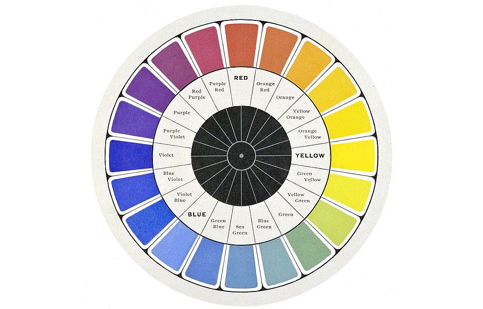
You've probably seen the complementary color wheel before—on an art classroom's bulletin board, or even just in your free time when researching design.
This handy wheel of reference is one quick and easy way to find complementary colors. This one refers to the subtractive family of complementary colors, but there are plenty online that refer to additive complementary colors, too.
All that you have to do is take any color along its perimeter and match it with the color directly opposite to it, splitting the pie in half. It's great to have this on-hand whenever you need a little bit of inspiration.
While Leonardo DaVinci may have been one of the first to formalize the relationships between complementary colors in his personal work, Sir Isaac Newton is actually credited with creating the first official complementary color wheel in recorded human history.
For a slightly more contemporary approach, however, you can find one really neat tool on the Canva website that modernizes this relic of art history. It's a digital complementary color wheel that allows you to plug in a hex code or find any color on a digital color field.
It'll automatically give you the color's exact complement, complete with a slider to control luminance. You can export a palette or even use it directly in one of Canva's many graphic design templates.
Why Are Complementary Colors Good for Design?
There is no reason that you should not be utilizing the power of complementary colors in graphic design. They can make a composition bolder, prouder, and more charismatic. But nailing it requires a keen eye.
For the sake of your time, we're going to avoid any discussion of complementary colors in the world of physical media, such as painting and work that involves clay. Luckily, there's plenty of color theory to chew on even when sticking strictly to the realm of digital graphic design alone:
- The major primary and secondary complementary colors are asertive and loud in their purest forms; if your goal is an attention-grabbing layout, they'll certainly be able to get the job done.
- Complementary colors make each other look brighter and more vibrant in context, even when their intensity has been reduced.
- They can be used to minimize eye fatigue—perfect for long, boring presentations or anything overly taxing on the viewer.
- When used sparingly, they call attention to important points, details, or elements.
Any time you need to grab your audience by the lapel is a time to give a complementary color pair the ol' college try. You might be surprised by what a difference the right duo will make.
Complementary Colors: Art Doesn't Have to Be Boring
To truly appreciate complementary colors, we recommend splashing a few into your canvas the next time you're falling asleep at your desk. Often, they're a much-needed dose of energy, and they cost zero dollars to employ throughout your work.


