I’ve stated many times over that Google needs to redesign its dated, archaic design of the Play Store on the web, and have even prospected how one may propel the company toward merging the Chrome Web Store themes and extensions with it. From there, I even played with the idea that one day, it will simply be called the Google Store, stripping itself of the Play branding, and merging with the existing Google Store. This would all allow the company to house apps, games, extensions, Chrome themes, hardware, and pretty much everything all in one place.
Well, at the time that I wrote that, this all seemed so far off since Google had no intentions of redesigning the Play Store, but guess what? They just did! Coming to us from Android Police via a Korean user, loads of screenshots and even a GIF of the new store design have leaked out early or have simply become available as a part of an A/B test. It’s also possible that this is rolling out globally, but just a bit at a time.
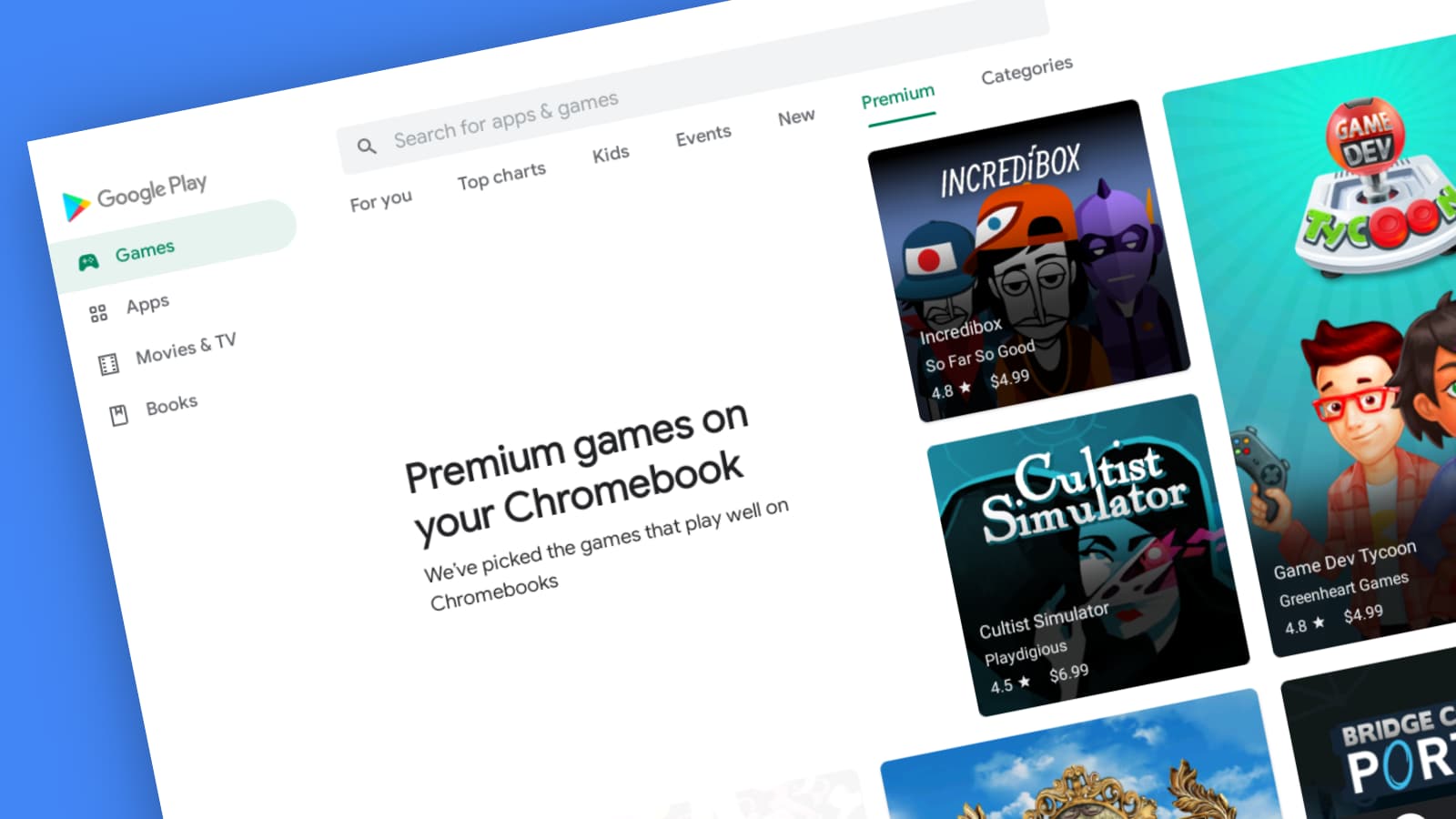
Take a good, long look at the image above. No, you’re not looking at the Google Play Store app for Android open on a tablet or Chromebook. That’s the actual web app! The biggest changes here on the face of the new design include top navigation in place of the old left-hand crazy navigation system, a clean, minimalistic background (which is obviously prepped for dark and light swapping), and big app images and banners with rounded corners.
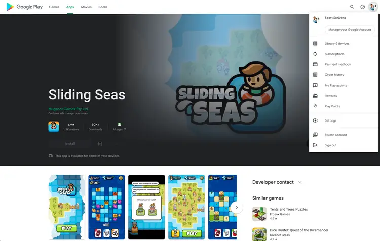
The other content from the sidebar, namely the family library settings, redemption option, Play Points, and more have now been moved to the top-right profile image just as it appears and functions on Android, so there’s consistency across the board now. I just want to stop for a moment and say that I’m so excited to see such a vital piece of Google’s ecosystem receive an app design that’s nearly 1-to-1 with its Android app counterpart. The web truly is the future, and this solidifies that fact even more!
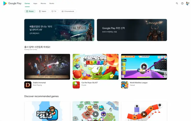
Here, you can see that when visiting an app listing, the page elements like headers, text, and more are thoughtfully laid out, larger, and more accessible. Game listings autoplay trailers in a hero header, with an install button displaying to the left, and a “Trailer” button on the right. This is just so incredibly slick, don’t you think?
Scrolling down, you can see that related apps, screenshots, reviews, and practically everything from the mobile app is identical here on the web. Even the search bar’s suggestion box has rounded corners, and everything feels very “Material design”. I hope that we begin to see Material You updates shortly after this goes live, and I believe this will become the case as Google Search on the mobile web is already displaying this new theming as of last night (GIF search).
According to the tipster who sent all of these shots to Android Police, some areas of the redesign are still under construction. For instance, he wasn’t able to access his app library, and several pages still displayed the old design when navigated to, but for the most part, the new design has taken over.
AP states that the those using Korean Play Store or the Taiwanese Play Store are able to see the redesign right now, but it’s likely a server-side update, so most of us will have to wait patiently for some undetermined amount of time. None of us were able to see the revamp yet, which breaks my heart, because I’m so extremely excited for this, but my guess is that if some folks are seeing it, this shouldn’t take long.
I’d also like to add that I discovered last night on Chrome OS Canary 98 that launching the web app version of Google Play Books or Play Movies gave me the official Android app icons instead of a generic Google logo, so I had a strong feeling something was up. I wake up to find that everything is being completely changed, and it confirmed my suspicions that these services on the web were being worked on to mirror their app counterparts – exciting!
Newsletter Signup

Leave a Reply
You must be logged in to post a comment.