
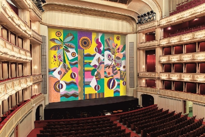
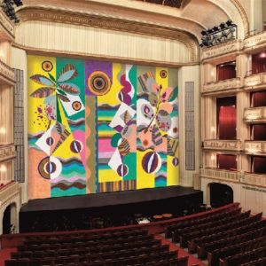
The ghastliness of Vienna Opera’s new curtain
NewsPass the sick bag.
Each year the Vienna State Opera commissions a new safety curtain for its stage from a leading artist.
Art can be good, bad or indifferent.
This latest hang by ‘by the renowned Brazilian artist Beatriz Milhazes’ is at once indifferent and altogether inappropriate. It diminishes the house.
The first response is nausea.
Beatriz Milhazes, Pink Sunshine, Iron Curtain, museum in progress, Vienna State Opera, 2021/2022, © museum in progress (www.mip.at)


Beauty is in the eye of the beholder.
It is impossible to get a sense of this new curtain from a photo. What you do get is wonderful colour and a perspective that is not middle European. I think it looks rather joyous and reminds us that opera is a world art form for many and not merely something for people to reinforce their prejudice.
It is NOT true that beauty is in the eye of the beholder. That is a fallacy which developed in the course of the 19th century and was the eternal excuse of 20C aesthetic nonsense.
Also it is NOT true that rejecting modern art must inevitably mean ‘prejudice’. It can as well be insight.
There is an inherent perceptive system in the human mind which recognizes order in visual stimuli, this has been researched and confirmed by neuroscience. And it appears that what humans experience as beauty, has to do with mathematical order, and types of balances between ordering patterns and deviations from them, in other words: the interplay of order and disorder. The latter quality can only function in a meaningful way as being subjected to an overall pattern that orders it.
All the great works of art of history of ANY culture show order as an umbrella over very diverse patterns which can include disorder. And all great works of architecture are lessons in aesthetics, however different lessons.
All of this means that beauty is a quality that is part of the object we see, and not a mere projection of our taste. The perception of beauty and order, which is a biological given, can be greatly developed by seeing many things over a long time. Our taste is the capacity to see and understand beauty that is there, and not a subjective projection entirely separated from the object.
Order is at the heart of the universe and everything that is in it. The idea that there is no objective meaning as for beauty, isolates the viewer, and throws her/his subjectivity back into an isolated position, as if nature had not created order at all. Of course many modern ‘artists’ get away with their nonsense, which is truly isolated from any objective aesthetics, to surf on the ignorance of the gullible.
I’ve to stop here, my PA begins to mutter and to rustle with her pile of letters –
You’re over analysing the comment John. The point is that some people will probably like the new curtain, as confirmed in some responses.
Precisely . Thank you.
Read John Borstlap again…
You wouldn’t need a PA if you didn’t spend so much time on SD…
You should be happy to get free instruction because I pay a PA to offer you the opportunity.
This is exactly right, and it could serve as a critique to Philip Ewell’s comments on Beethoven. People think of Beethoven as a great composer not because of a white racial frame, but because it connects with how the human brain perceives music.
This is not something that John or I made up; it an observation of cognitive scientists.
Correct.
https://www.scientificamerican.com/article/the-neuroscience-of-beauty/
DEFINITELY Degenerate art.
But the curtain would be much suited to prepare audiences for an opera by Olga Neuwirth, the Austrian punk composer (as she says herself).
Sad.
Each to his own. I actually think it’s rather nice and very different…
Yes that’s my impression. People who don’t get the stirr are mere snobs!
Sally
Sweetie Darling it’s a La Croix…..
Oh sorry, I thought the critique was wriggled in there by Saffron Monsoon
I like it. It brings a touch of sunshine into what is at the moment a rather dreary world. It is vibrant and joyful.
Obviously, it is only vibrant and joyful in the Brazilian jungle, far away from Vienna and what it stands for.
Do enlighten us as to what Vienna stands for.
It’s a CURTAIN, for God’s sake. It’s not forever. They didn’t cover over the gilding.
For the count, I like it.
Everybody who has been to Vienna and spent some time there, and knows about its history and the culture it produced, and understands the meaning and position of the State Opera in the city, would immediately see the blunder of this curtain, which intervenes into the space as a loud scream from a very different world – and a very primitive and silly world at that.
It’s the theatrical equivalent of Munch!!
I disagree, I think this sad Mona Lisa would be much more appropriate and fitting for Vienna, as well as going along with the state of how women lives were portrayed in opera. https://www.artstation.com/artwork/3oVNwY
This Mona Lisa, for example would be completely INAPPROPRIATE! https://p.favim.com/orig/2019/04/05/sad-mood-vintage-Favim.com-7046627.png
No, you know what? I think it’s totally inappropriate now, because would one look at it long enough, you can start hearing stuff that’s more in tune than the the orchestra is capable, of. Or even SINGERS, especially one particular one who sings things others wouldn’t think her voice is big enough for, but adds her inability to sustain pitch to the expression and needed humour! In fact looking at that painting TOO LONG and starting to hear something more in tune than what’s going on under or on the stage might start confusing the mind, and it might start preferring what’s in tune, not knowing it’s not coming from “outside” of the mind voices, since how one hears it can’t be considered from inside the mind, otherwise people might like the painting, to begin with and would show signs of this very dangerous phenomenon called SCHIZOPHRENIA. So it’s totally INAPPROPRIATE!
Nature does not progress from square to square, nor does she exist to be put in one; the very lines in the painting, and forms, how they deviate from the square lines of a “civilized” city, harsh lines that look more like a purveyers outline on how to take over an area than what blossoms there, this painting eases the eyes instead, as do the colors that are softer and more tender: the pinks green purple yellow….
This also in contrast to a lot of modern music that sounds like car horns blasting, the whirring of wheels, all sorts of alarms, and the anxiety and apathy that such causes….
Is there a reason I can’t copy links or texts from this page? If I would like to access http://www.mip.at I can’t copy the link. If I would like to google for the artist name I can’t copy the test. Is this only on my platform (Safari on macOS) or is this by design and if so why?
I can’t either, on my laptop. (Not a Mac).
Same problem here (windows laptop), just in the past couple of weeks.
But this must be a joke?! Even on a small photo it looks utterly ridiculous, like a mockery.
Thank you for sharing your profound understanding of art and art criticism. Words like “joke”, “ridiculous”, and “mockery” demonstrate a depths of appreciation and refinement only few people can aspire to.
I now feel enlightened and educated. Or perhaps not…
Because of the phone ringing here nonstop this morning, I got a look. And I love it! One must have a subtle eye and reeeelly intelligent mind to appreciate all the lively colours & forms and there’s even a reference to Vienna, there’s a coffee bean in it! What a brilliant idea. It’s the coffee houses that have inspired the artist. Audiences will immediately recognize the hint. I don’t understand at all all of that slandering and protesting and stuff, and it merely leads to distractions, I’ve to answer all those angry art specialists here.
Sally
I’m sure Homer Simpson is in there somewhere.
much ado about nothing……
As is the case with so much in art, politics and life, it’s what goes on behind the curtain that’s most important …
Looks to me a bit like a beach towel. But why not? Anything to shake up the fusty Viennese before the next production of Die Fledermaus.
As the ‘Fledermaus’ song goes, “Chacun a son gout”!
So far I’ve counted 3 Ninas.
Comment of the day! I like the curtain, BTW.
I’m still not over the glass pimples defacing the Louvre. Blow em up!
Ageed!! Distracts from the beauty of the house and imposes a mood that is entirely at odds with its surroundings.
Voilà, korrekt auf dem Punkt gebracht.
Do certain productions distract from the “beauty of the house” as well? A theater is akin to a factory; all that matters is what occurs on the stage. If not, then seal it up for posterity and unearth it like Tut’s tomb.
The birth of opera went together with the birth of opera house design, and the idea was to create a space as much as possible removed from daily life and with an atmosphere of something special. An ‘opera house factory’ is a 20C idea of functionalism, which was the result of the misunderstanding that only material functions had any meaning. But a concert hall, a church, an opera house, if they are well-designed, combine both material and aesthetic/exmotional functions. Music is an immaterial art, so it is logical to conclude that aesthetics and emotional effect of a space are important.
Sounds like an academic conference Mr. Borstlap. Maybe more borscht in your response would make your comment more digestible.
That’s what I’m saying all the time. I’ll keep trying!
Sally
It took 1 minute of google searching to see all of the previous safety curtains, and this one is is pretty consistent with what the State Opera does each year — if you hate this, then you’re bound to hate the previous 23:
https://www.mip.at/en/projects/safety-curtain/
It’s pretty neat how they’ve used the safety curtain to turn the inside of the hall into a temporary exhibition space for contemporary art.
And compared to the previous ones, this one is more colorful and vibrant.
thanks 🙂
It doesn’t go with the design and decor of the rest of the building. Remember, this is the same building whose architect hanged himself because he couldn’t deal with the public’s criticism!!
The top left corner looks like the dead horse in Guernica. It’s very off-putting
A friend of mine once gave me a book called ‘The Rules of Life’. One entry said: ‘Don’t eat anything bigger than your head. Don’t eat anything with tomato in it. Don’t eat anything that looks like vomit’. Break all these rules – eat a pizza’.
OK – the curtain does not have a tomato in it as far as I can see, but it does meet the other two criteria so I don’t think I’ll be eating it.
Love it! You sourpuss.
what do they do with the curtain at the end of each year?
I hope they auction it off, it’d make a great rug for my living room.
They roll it around a contemporary composer and drop the thing in the Donau.
The work is almost like a celebration of orphism. It looks both fresh, happy, and reminiscent of those wonderful works by the Robert/Sonia Delaunay.
But did you know what the couple were doing when they locked the door and closed the curtains?
this is not really bad, nor is it any good. what it is, is of the times- already dating itself, much like the vogue for postmodernist 1980s retro in contemporary art and design. give it a year or two (hopefully less) to run its course, and then something else will replace it. just be thankful that the curtain was not some trite statement on racism, sexism or some such thing.
There’s good art, bad art, and THIS.
Where’s Waldo?
What’s so bad about it? It s something between Art Nouveau and Brazilian ethnoabstractionism.
Well, that’s why.
Like them or not, the Vienna Opera has been commissioning avant-garde curtains for a number of years. Check out some examples: https://publicdelivery.org/vienna-opera-safety-curtain/
Too bad! It’s disgusting. I know of Viennese who go to the opera and sit with a face mask over their eyes until the curtain goes up, to protect their aesthetic perception framework from being deeply offended by the misconceived attempts to have ‘modern art’ add to the theatre experience. And these are young people, deploring the conservative bad taste of their elders.
reminds me somewhat of Kandinsky or Miro. I like it.
to be honest, if this was a permanent installation, i would not welcome it, but as it is something that is changed every year, why not give different things a spot under the sun for awhile?
definitely not “ghastly”, as this snob of an author wrote it, maybe abit out of place, but why not, for a change. it lasts only a year. and i rather like it on its own.
Beauty certainly is in the eye of the beholder. Who would find a hefty Rubens woman beautiful today? Fashions change, you only have to look at paintings down the centuries to see that. If they didn’t, men would still be wearing tight breeches and women crinolines.
Rubens’ depictions of over-eating women are not so much admired for their models, but for their painterly qualities.
Gag – the polite response.
It would make a fun shower curtain…
As I always say, modern art is a con.