Choosing the colour palette in your home is one of the most impactful design decisions you will make. Of course, not all colours are created equal, and there is a mountain of research that looks at how we perceive colour, and the effects it has on everything from productivity to appetite, as well as the pitfalls of using colour incorrectly.
“Colours can have a profound effect on us both mentally and physically so the colours in our home are important for our health and wellbeing,” says Valerie Logan-Clarke, Colour Therapist and founder of Colour Therapy Healing.
Here, seven interior experts share their design tips for creating the right colour palette for each room according to its use, layout, and access to natural light...
Shades of red for a rich setting
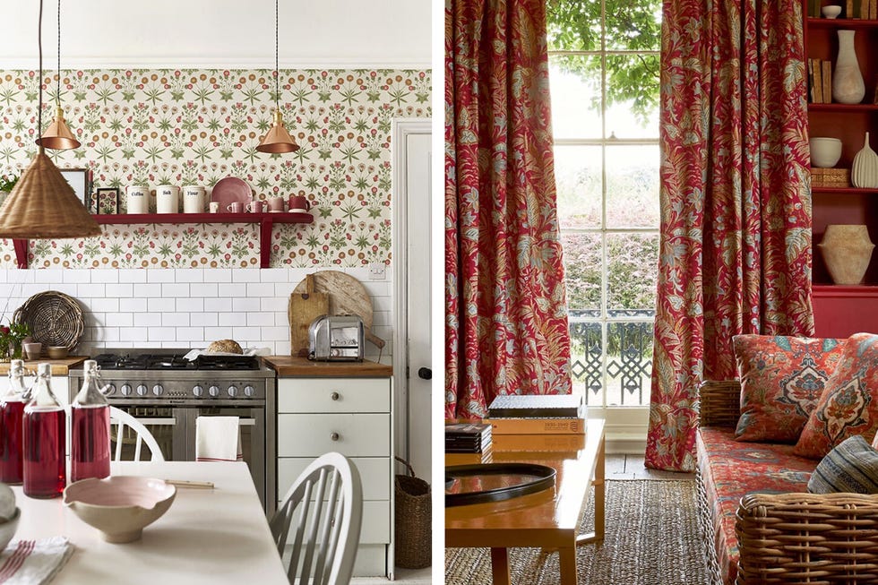
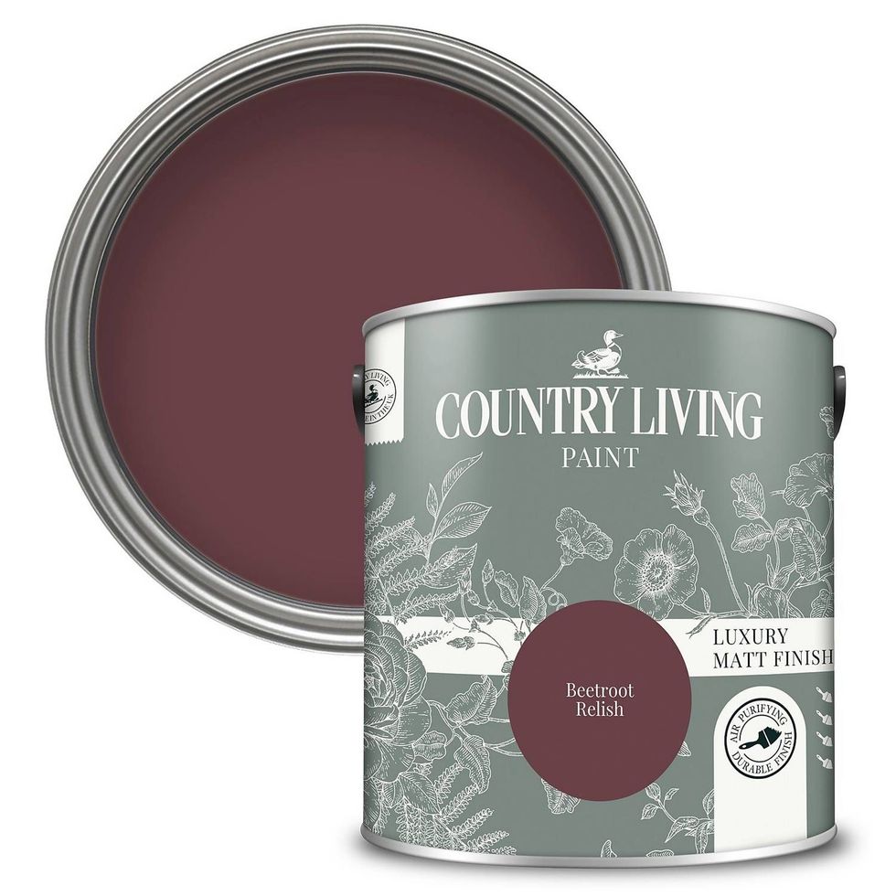
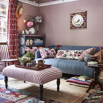
Red is a deceptively versatile hue for the home. Glossy pillar box reds can be energising when used as a feature wall, deep burgundy is moody and romantic in a bedroom, or a spicy, orange-toned red looks lifted from mediterranean villa. "It’s important to consider the lighting in a room when painting it a colour such as red," says Camilla Clarke, Creative Director of Albion Nord. "This colour takes on slightly different tones throughout the day and the seasons. It’s vibrant and fresh in the morning, cosy and rich in the evening."
Red is a great choice for darker rooms, instead of trying to artificially lighten a dark space with colour, embrace a moodier theme with a rich burnt red like the Primer Red from Annie Sloan. "Primer Red is particularly inviting in shadowy rooms without much natural light," says founder, Annie. "This intriguing, inviting tone – somewhere between terracotta and burgundy – combines beautifully with warm neutrals and hints of brass and gold."
Calming earthy hues
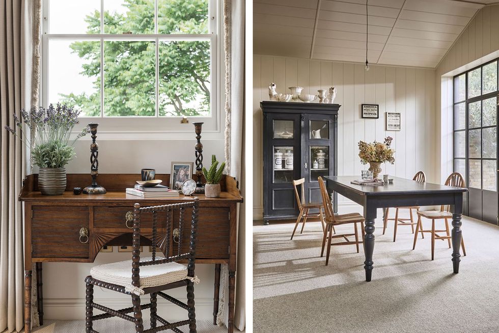
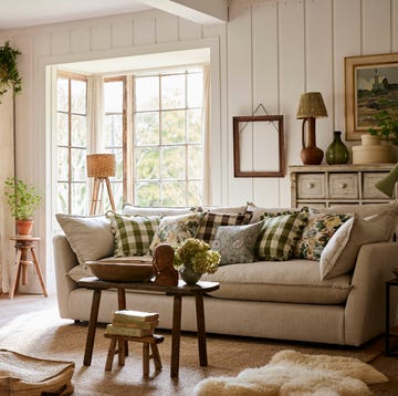
"Our favourite hues to use in an interior are muted tones which create calm and soft spaces," says Camilla. "We love to use earthy colours such as greens, ochres, chocolates, and cream design schemes. Greiges/fawn colours are very good neutrals that create warmth in a room but allow you to layer and contrast in front with colour and tone."
She suggests embracing a multitude of brown shades to create a quiet sanctuary space. 'Try and avoid colours that wash into each other. Brown shades should be complemented with fresh tones such as creams and whites to counterbalance their richness. It’s all about contrasts when using a variety of brown shades in a room. If you’re using furniture and art with similar hues, it should stand out from its backdrop to create interest."
Pick a soft, creamy base for your floors and walls and go for antique furniture in rich woods like a mahogany or walnut.
Bold blues
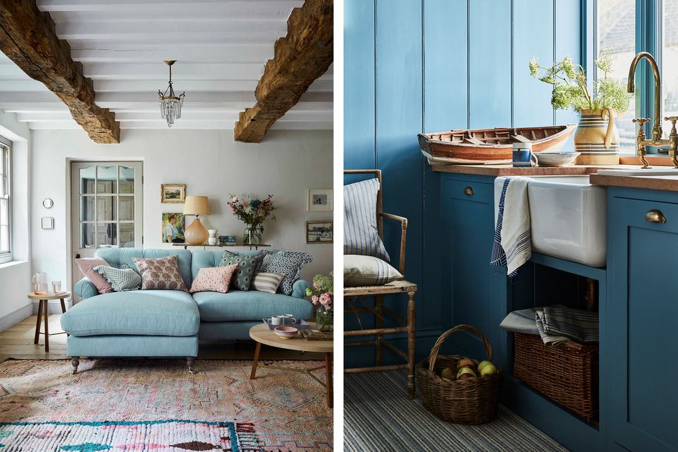
"The boldness and warmth found in blue will continue to be prominent in our homes. Darker colours form a much better background for paintings and artworks than white," says Martin Waller, founder of Andrew Martin.
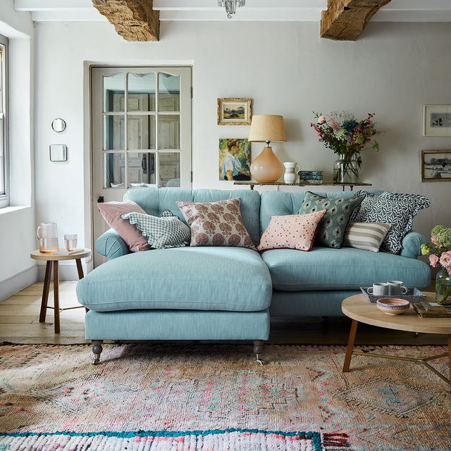
Blue is a brilliant shade for a bold monochromatic scheme, but if you're hesitant about an all-over blue, Martin suggests starting small. "Start your transformation in a cloakroom or small bedroom, since richer colours work well in such spaces, despite the accepted wisdom that white paint makes a room seem larger."
Blue is entering the kitchen as a nature-inspired alternative to green. "As people look for more contemporary takes on classic palettes alongside brighter environments, we are seeing lighter shades of blue kitchens increasingly grow in demand," says Jen Nash, Senior Design Lead at Magnet. "These heritage-inspired shades offer a timeless, fresh and versatile approach but with an added sense of playfulness and personality, at home in both classic and contemporary spaces.
“Similar to green, the translucent, airy quality of these blue shades are evocative of nature - creating a feeling of serenity that works in tandem with the social demands and functions of a modern kitchen.’’
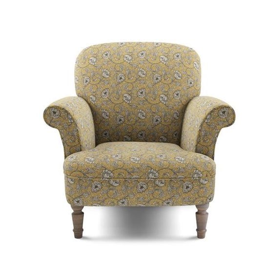
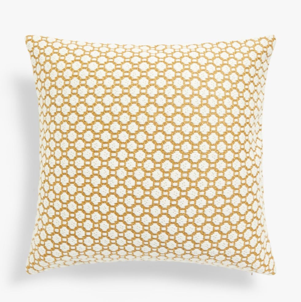
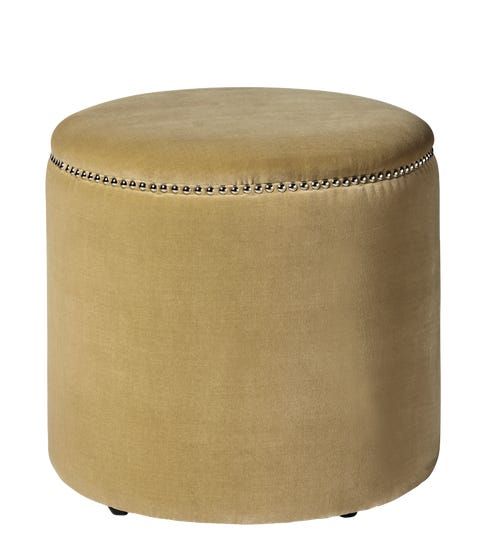
Yellow for an uplifting interior
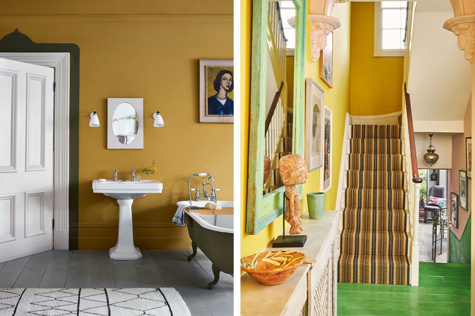
The cheeriest of colours for a happy home. We're fans of a deep, saffron yellow used in abundance across living room and bedroom walls.
"For a living room, the use of yellow can create a mellow and uplifting interior all at the same time. It transports us back to long lazy sun-drenched days in the Mediterranean and it can brighten us up on gloomy days," says Martin. "It works brilliantly with blues, teals, greens and reds, and for real crisp freshness use with white. But if you want to opt for tones such as grey, this will help create the illusion of space."
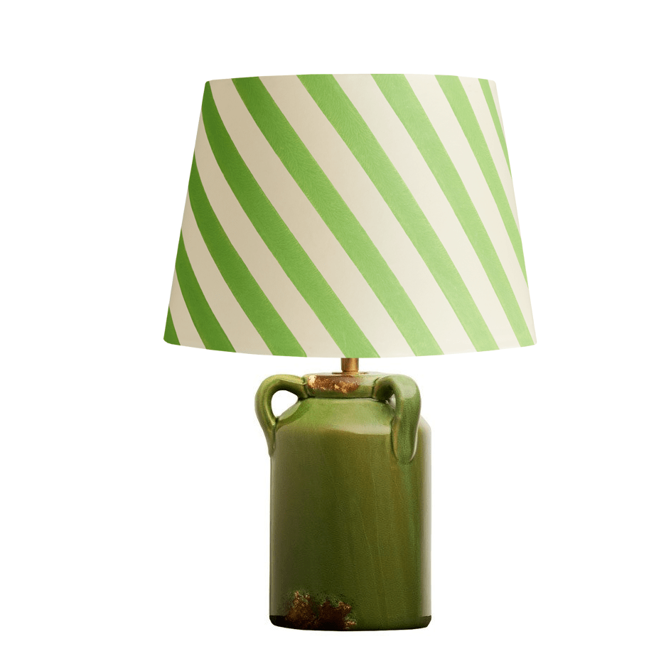
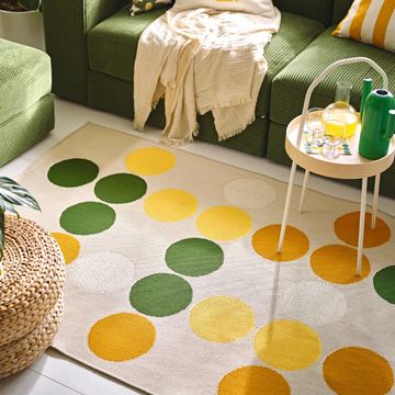
There is also a case for adding citrusy yellow tones to green rooms. “For a mood boosting take on green interiors, try introducing joyful tones through yellow curtains to give your home a hit of dopamine," says Amy Wilson, interior designer at 247 Curtains. "Using both these colours in tandem creates a happy home which replicates the brighter seasons of spring and summer all year round.
“Yellow doesn’t have to be in your face, there are so many tones to choose from to create a peaceful space that's both bright and light. For example, if your home is covered trendy sage, try pairing it with sorbet lemons shades ”
Classic country green
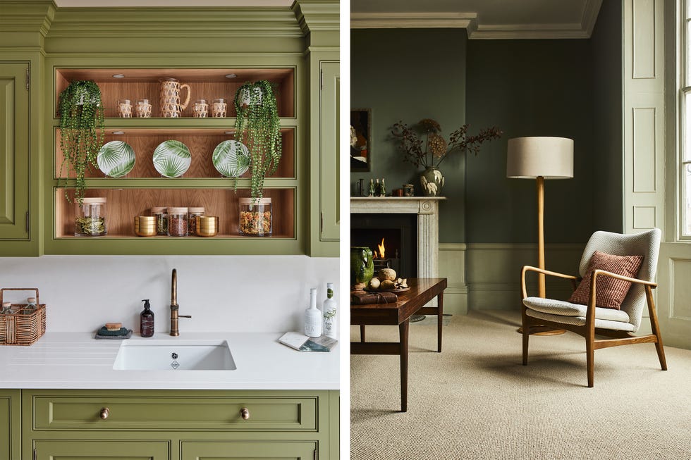
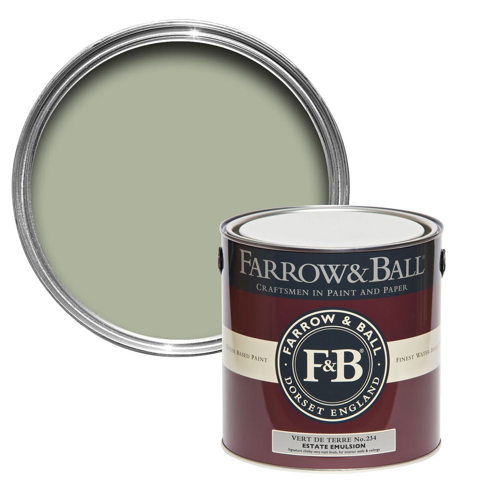
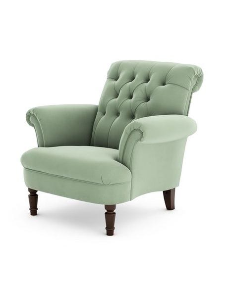
A classic country colour, green can sit happily in most rooms in the home, as a rich and moody hue in a study or living room, or a fresh avocado shade in a kitchen.
"Green kitchens are having something of a moment right now," says Tom Howley, Design Director of the eponymous kitchen makers. "As a colour we associate primarily with nature, this grounding shade has an incredible way of reconnecting us with our surroundings, creating moments of calm and positivity."
An earthy olive is a chameleon of a colour, Annie Sloan's Olive being a great example. "It can be a neutral, dropping into the background or it can be the shining star of a colour scheme," says Annie, "it’s warm, earthy, and mutable – a useful colour and real hidden gem. It’s a classical shade, but also works as an anchor for a cool 1950s mid-century modern colour palette when paired with harvest golds, oranges and pale blues."
Dark and dramatic black
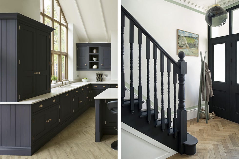
"Dark and dramatic paint colours such as black have a way of adding ambience and sophistication to a space. Dark shades can come across as intimidating; however, it’s in the way you use them that changes the feel," says Tom.
A black and white kitchen makes for a classic pairing. "Used on the main run of base and wall cabinetry, dark colours can look luxurious and courageous while still having a timeless, intimate appeal. If you’re not feeling as brave, then combine dark paint shades with a green accent or a classic neutral like soft whites for a balanced look that still has an impact,” says Tom.
The right white
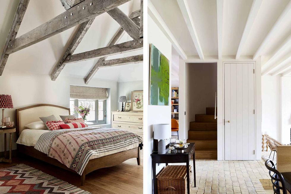
Finally, choosing the right white for your room takes more design consideration than you may think.
"There are two killer questions when it comes to choosing the right white paint, and a fundamental rule to follow," says Aaron Markwell from COAT Paints.
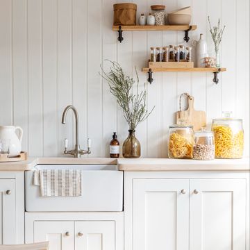
"Firstly, what direction does the room face? Get the compass out on your phone and check. In all cases, North-facing rooms have a cooler and less intense light, and South-facing rooms are naturally brighter and warmer. So if you’ve got a North-facing room choose a white with yellow or brown undertones - a bit creamier or earthier, like ‘Pampas’ - to help neutralise the cooler northern light. If you’re blessed with a sun-filler South-facing room then you can go bright white if you like, or choose something that’s very slightly grey like ‘Sweatpants’ to knock out the yellow light and create a more balanced white."
"The second question is how you want to feel in the space. Bright white like ‘Screenshot’ is naturally quite stark unless you soften it with furnishings, whereas creamier whites are warmer but not quite as crisp. A nice mid-point could be a very pale Greige like ‘Mindful’ which has greyish-brown notes that add an earthiness to the white without it feeling magnolia."
