Common Mistakes People Make When Following Design Trends
Our homes are our sanctuaries, and creating a home that represents your unique style is definitely a life goal — because what can be better than being in a space that is genuinely ... you? Suppose you are looking to enlist an interior designer to spruce up your pad or plan to design your home's style yourself (heck, because sometimes the budget gets in the way). In that case, some mistakes can be made along the way, especially when following design trends. "We're always asked by clients if they shouldn't use something in their design because it's a trend and may go out of fashion soon," says Athina Bluff, founder and senior designer at Topology Interiors to Home & Gardens.
It's true, we've said goodbye to some design trends: accent walls, faux plants, and the all-white kitchen in favor of all-wood kitchens (without the cabin feel, may we add). Per Insider, gray kitchens, shiplap (sorry Chip and Joanna!), and mid-century modern furniture are out. So here they are; keep reading to see the most popular design-trend mistakes people make.
Going too crazy with popular design trends
While it's nice to follow the latest design trends when it comes to our home's interior, going overboard on too many trendy items can actually work against you. Interior designer extraordinaire and co-star of HGTV's "Nate and Jeremiah by Design" and "Nate & Jeremiah: Save My House," Nate Berkus tells MyDomaine, "The mistake people make is that they're often insecure. They look over their shoulder and listen to what everyone else is talking about instead of sitting down and asking, what do I really love?" Berkus suggests taking an edit of your space and making it your own by creating a home that truly speaks to your personal design aesthetic.
If you think more is more when it comes to design, think again! "When you declare more is more, it better be more quality pieces, more collectible than otherwise, and more taste than money can buy," says New York interior designer Richard Mishaan of Richard Mishaan Design to Elle Decor.
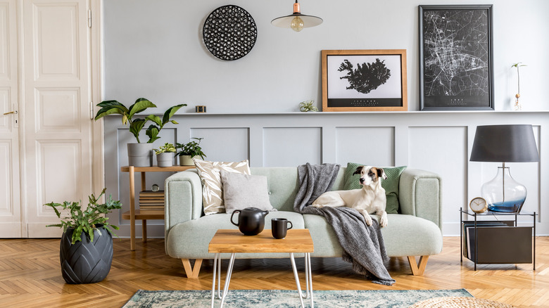
Not having different heights of furniture
People can make one big design mistake in their homes; specifically, their living rooms do not utilize different heights for furniture choices. "Without sounding like a drama queen, scale and proportion are the holy grail of design. If everything is the same size or if everything is either too big or too small, your room will read like a hot mess," explains London-based interior designer Abigail Ahearn to MyDomaine. If you're wondering how to fix this age-old dilemma, Ahearn says that "The easiest trick is to think of your space as a city and fill it with a combination of heights and proportions. Look at any cityscape, and you'll find this intriguing mix of scale and a unique blend of fascinating shapes — that's what you want to nail!" Using different sizes and proportions of furniture can really gauge interest in a space, giving the eye different parts of the room to admire.
The Spruce suggests looking at ceiling height as a way to see what height of furniture your room can handle. For example, if you have extraordinarily high ceilings, your room can handle a taller armoire. If your room has lower ceilings, aim for furniture that can fit the scale of the room.
If you are in tight quarters, you may want to lose the dark furniture
If you're in a smaller room or reside in a studio apartment, you may want to rethink darker furniture in the space, such as deep navy couches or black velvet — but that's not all you need to fret about. According to Houzz, darker furniture can also give a room a more gloomy aesthetic. If your room is larger, they note that the room can be brightened up with colorful walls, drapery, or even pops of color in your pillows, which can affect your overall mood for the better.
Tali Roth, principal and founder of Tali Roth Interior Design Studio, tells MyDomaine that darker furniture in a small space can be a big mistake. "When it comes to small apartment living, we need to go for lighter fabrics and finishes that will lift the space," she explains.
Your artwork is hung too low or too high
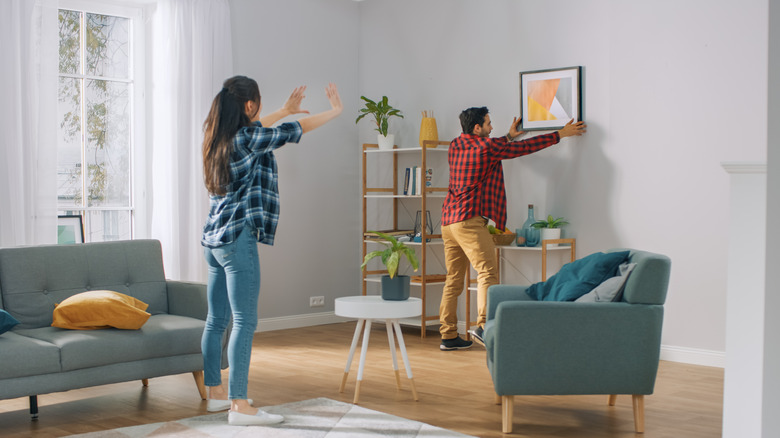
There are so many things to consider when choosing artwork for your home, from budget to style. Plus, if you're renting, you don't want to upset the landlord with tons of holes in your walls, now do you? Apartment Therapy notes that hanging a piece too high is a common mistake for many homeowners or renters. Those issues aside, there is an art to the proper level that you hang your artwork, and designers see this mistake quite a bit.
Studio McGee shares it's the number one culprit they see. Thankfully, they have some suggestions for getting it right; they say to think about the scale of your artwork and hang the art at eye level, and if you want to get specific, they suggest 60 inches from the ground usually gets it right. They recommend 4 to 6 inches if you are hanging art above a couch or chair.
The lighting is off
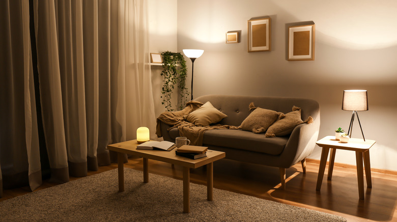
Another snafu that many people make in their homes is not enough lighting or wrong light placement! Lighting can brighten a windowless hallway, elevate your mood (especially during the dark winter season), and even highlight exterior features. All in all, lighting can be a total game-changer in a home since lighting is essential to most people (heck, even celebrities like actress Shailene Woodley know how important lighting it is to keep a home sexy).
Just as you may layer your clothes when cooler temps hit, Athena Calderone, founder of EyeSwoon, has some advice for layering lighting in a home. "Be sure to have lighting on dimmers and also coming from multiple sources at different heights, [such as] floor lamps and table lamps. And always choose soft white bulbs. Warm lighting not only sets the mood but also makes a room feel intimate and aglow," she told MyDomaine. When it comes to lighting, we couldn't agree more!