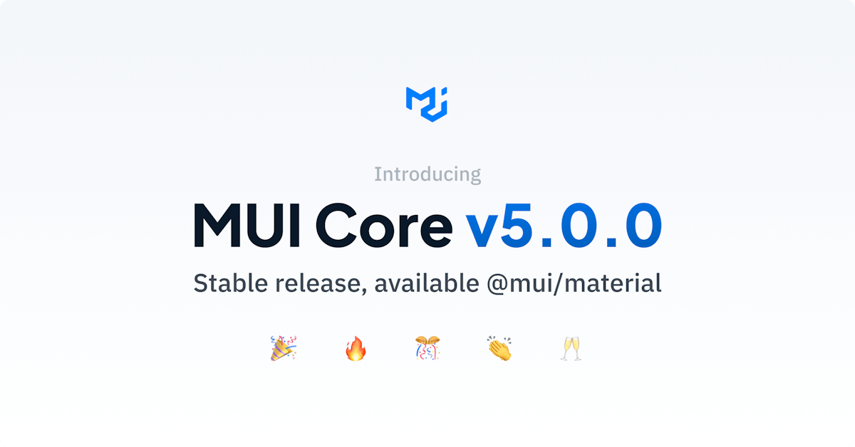
Brings advanced styling and customization features, new components and more. MUI ( ) has released the latest version of its popular React component library – MUI Core v5. formerly Material-UI [1] Fifteen months in the making , v5 features a new style system, better customization, new components, and a host of visible and not so visible enhancements to improve both user experience (UX) and developer experience (DX). [2] Styling & customization MUI has adopted , allowing fast dynamic styling and eliminating the overhead of bundling a second style system when using emotion or in the app. This change has also enabled the simple yet sophisticated customization of components via the global theme, which allows the creation of new component colors and variants (collections of component styles). These are then selectable with the respective React props, with no changes needed to the underlying component. emotion as its default style system styled components Every component now also sports an , which can be used to directly style the component with either CSS or utility shortcuts while taking advantage of design tokens from the global theme. sx prop Finally, the components now always come with , which can simplify the customization of complex components. global CSS class names New components The include an improved , a for handling simple layouts, as well as components that have been maturing in the lab for some time: , , , , , and . new components layout Grid Stack component Autocomplete Pagination Rating Skeleton Speed Dial Toggle Buttons To ease , MUI has developed a comprehensive to automate the upgrade of users’ code and provides a step-by-step . migration from v4 codemod migration guide Developers have spoken In an email, Anthony Bouch of web consultancy said: infonomic “The combination of emotion and the sx prop is brilliant. I’m also super impressed with the effort that went into making everything backward compatible. We can take our time and convert components to either ‘styled’ or ‘sx’ whenever suits. “I love the new components styleOverrides and defaultProps in custom themes. It’s a much easier and more logical way to customize theme components. I’m in awe of the amount of work MUI have put into this.” Meanwhile, on Twitter, user didn’t hold back: “sx props is a game changer for Anson LowZF v5. No need to scroll up and down to check my makeStyles' CSS. 👍” @MaterialUI A word from the boss When asked for comment, MUI CEO said: “We’re extremely proud of what we’ve accomplished with MUI Core v5. Both the team and community have worked incredibly hard to deliver this groundbreaking release. And we’re not stopping here!” Olivier Tassinari Despite all this, the MUI Core components remain completely free to use, being published under the MIT license. Details of these and many other changes and improvements are covered in a comprehensive . blog post Over , and over from . [1] 70K GitHub Stars 2.2M downloads per week npmjs.com ...with over 5,800 commits from over 600 contributors and over 40 canary releases. [2]