Sling finally rolls out its new update, features slower scrolling and harder to use Guide
Sometimes those old sayings from our youth prove to be true. "Be careful what you wish for" is one that springs to mind.
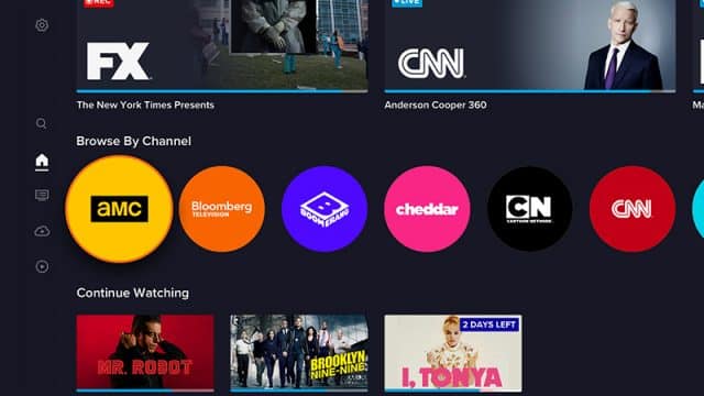
It’s been over a month since Sling announced a fresh new interface update was on the way. Now it begins finally rolling out. One thing that is readily noticeable is that it truly is a brand new interface. Almost everything has changed.
Whether that’s for better or worse is really a matter of personal taste. Some changes may grow on us and we’ll forget what it is we missed, but for me, personally, that may take a while, and here is why I say that.
The change of the channel ribbon in the guide from the top of the screen to the left side is minor, but is the most obvious thing you see when you get started. I like it less on the side than the top, but it isn’t the end of the world. However, scrolling through it isn’t as snappy as before; if you’re looking for a show that is on later then you’ll need to click the channel name to get the future lineup. And shows you’ve set to record no longer show a white dot next to them -- you’re on your own figuring that out.
You’ll also notice that "My TV" plays less of a role in your usage. In fact, it’s just a part of the "Home" option now. While previously you accessed that in order to get to your recordings, "DVR" is now a prominent feature next to the side menu. Inside of it things have changed as well.
The view of the current recordings is the same, but you’ll need to use a top menu in order to view your available recording time, it’s not shown with the shows anymore, which is rather annoying. On the other hand, something we’ve all probably wished for at least once has been introduced -- "Trash". Yes, you can now get back what you accidentally lost, which is a nice feature. And finally, DVR now allows the option to delete a show right from the recording, no more having to switch to "Manage".
Fast-forward bears a look at here as well. It used to show the speed on the screen, beginning with 4x and then doubling each time you clicked the FF button. 16x, three clicks of the remote, was a good speed for commercials, at least to control and not miss a second of your show. Instinctively I clicked three times in the new interface and before I could move my thumb to the play button the entire show was over. Be warned it now has three levels of speed -- fast, faster and light-speed. One click is pretty fast so you’ll need to pay attention because a block of commercials is over in a couple of seconds.
In summary, it isn’t all bad. The new "Guide" setup is definitely funky and not in a good way. As I said, choppy and slow. I’ll give the move of it to the side of the screen a pass, but mainly because the other problems make it acceptable.
The new DVR is a winner, except for available space requiring the selection of a different menu option, and the fast forward being slightly out of control.
If you're a Sling user and have the new interface, let me know what you think of it in the comments below.