Designers Share Their Tried-and-True Shades From the Best Interior Paint Brands
It all depends on the finish you’re looking for.
Updated Oct 12, 2018 2:06 PM
We may earn revenue from the products available on this page and participate in affiliate programs.
Reviewing rows of paint swatch cards over and over would make anyone want to close their eyes and just point to one. Stare at them long enough and they’re all the same anyway, right? Not so, as you might suspect; there are several factors to take into consideration when selecting the best interior paint for your space, and finish should be top of mind. “When it comes to paint, finish is majorly important,” stresses Caitlin Murray, principal at Black Lacquer Design. The texture of a surface, whether it’s the walls, trim, or kitchen cabinetry, plays a huge role, as does how your light source interacts with it.
That’s why selecting even a neutral color can feel tricky; in certain settings, like small, windowless spaces, white in a flat finish might read more beige than you’d like. Designer Leanne Ford has her own strategy for keeping choices simple: She uses three go-to white shades in a couple of finishes. “I like to use high gloss when going modern and a matte finish when I want the space to feel vintage,” she says. “I rarely use an in-between.”
Each paint brand has strengths when it comes to finishes, so are you ready for a primer? We tapped Ford and 10 other designers for their advice on the topic—plus we snagged their favorite color and finish pairings, too.
- Best flat: Farrow & Ball
- Best matte: Benjamin Moore
- Best eggshell: Clare
- Best satin: Sherwin-Williams
- Best gloss: Fine Paints of Europe
A Few Things to Keep in Mind
Finish: Every paint brand has a variety of finishes (some even have their own names!), but in general, the most common types can be narrowed down to these five, in order from the least to the most sheen: flat, matte, eggshell, satin, and gloss. “Each kind of paint finish has a different level of shine and reflects light differently, so it’s important to decide what mood you’re trying to set in the room,” offers designer Kathy Kuo. “For instance a lot of people lean toward a matte finish since it doesn’t reflect light—it actually swallows it—to more easily hide any imperfections.”
In fact, that’s why Murray likes to use satin on trim work that might be looking a little worse for wear. “One of the main things to remember is that the more texture on a surface, the more pronounced it will be with paint of any sheen,” she says. A glossier finish on woodwork always looks great paired with matte walls, she adds. And there are some durability rules to follow, too. “The greater the sheen, the more cleanable it is,” points out Ford, which is why matte looks best for areas like the living room or bedroom, and a shinier finish is best for high-touch surfaces such as cabinets and areas prone to moisture, namely the kitchen and bathroom.
Nonetheless don’t discount the look you’re going for—a glossier surface will feel modern, whereas matte often translates as more traditional or classic, notes Ford. That’s why it’s important to test out your choices. “We actually have thousands of finish samples in our office from every vendor we use,” shares Heather Weisz, principal designer at HW Interiors. While we’re not suggesting you call in that many, you don’t want to forgo this part either.
Color: When narrowing down swatches, the way a color’s pigments are perceived will be strongly affected by the finish. The glossier the finish, notes Murray, the darker the color will appear. To this point, Apartment 48 designer Rayman Boozer always recommends picking out a paint that’s a touch lighter than your favorite. “The paint soaks into the wall and it’s going to read darker,” he shares.
Of course, finish isn’t the only factor to base your color choice on. In general, bright and saturated hues in a satiny finish are the best if you’re looking to bring a bit of energy into a space, whereas cooler, muted options like pastels offer a more calming effect. Neutrals are best as the blank canvas to let your furniture steal the show, but a dark, bold color like charcoal black as an accent wall (or even a painted ceiling) can be used for dramatic flair.
VOCs: You’ve likely heard of this acronym before. Volatile organic compounds produce that strong smell that lingers after a fresh coat of paint. These invisible gases are released into the air while paint dries, potentially causing headaches and other harmful malaise. “There is an increased awareness of how harmful they are to the planet’s health, too, and brands are making inroads to reformulate their paints to accommodate new regulations,” says Keren Richter of White Arrow. It’s why most designers today opt for water-based paint and why many clients demand them, adds designer Raili Clasen. Sure, they may not be as durable as their oil predecessors, but acrylic or latex have certainly come a long way. In any case, to avoid breathing in that dreaded new paint smell, experts advise opening up all the windows, turning on fans, or waiting (if you can) to give your home a color update during drier months.
Our Top Picks
Best Flat: Farrow & Ball

Estate Emulsion is the flat paint finish revered by contractors, designers, and DIYers alike, including Team Domino. The British paint purveyor achieves an ultra-matte look in its signature chalky finish with a minimal, 2 percent sheen level. “I love the way light plays with it, bringing out different tones throughout the day,” deputy commerce editor Samantha Weiss-Hills shares. “It always looks chic and softens the edges of the room.”
One of Weiss-Hills’s favorite shades is Wimbourne White. Described as just a shade away from a pure white, the smallest addition of warm yellow creates a powerful neutral that appears to play well with all other color schemes. Tap it for its versatility and cozy vibes, just as our contributing style editor, Benjamin Reynaert, has for his new Wilmington, Delaware, home.
Estate Emulsion is also perfect for small spaces, notes Megan West, head of brand and creative studio at Domino. She swathed every inch of her office in Sulking Room Pink, including the trim, ceiling, walls, and built-in shelves. “It feels cavernous yet soothing, and I love how it changes with the light throughout the day,” she says.

Best Matte: Benjamin Moore

“I always love a light and airy color on the walls because it allows a lot of flexibility with the design you create in the space, while also opening up and making it feel larger,” says Kuo. “Most recently, we incorporated Chantilly Lace by Benjamin Moore into a design project in a matte finish and it instantly became a favorite of mine.” She used it on both the walls and fireplaces throughout the home, and felt it created the perfect backdrop for that cozy, modern farmhouse aesthetic the client was after. “It’s not too cool and not too warm, encouraging light to come into the space and bounce off the walls.”
Although multiple designers referenced the brand’s Aura line, Boozer loves Benjamin Moore for all seven of its finish options—there’s a sheen for everyone, so to speak.

Best Eggshell: Clare

Nicole Gibbons, CEO of Clare, started her business with the goal of demystifying the paint selection process; that’s why there are only two finishes to choose from: eggshell for the walls and satin for trim. Both Boozer and Mercedes Kerrison, founder of Abode Staging + Design, love the brand’s supersoft colors. “Clare is an extremely high-quality paint with great coverage,” shares Kerrison. For this living room and dining room—both of which receive a lot of north-facing light—she chose Windy City. “It’s a clean, gorgeous medium gray with just the right amount of warmth and a nice subtle sheen,” she adds. But perhaps the best bonus of going with Clare are the large, 8-by-8-inch peel-and-stick swatches, which can easily be moved from room to room. According to Kerrison, they are far more user-friendly and cost-effective compared to having to purchase sample cans.

Best Satin: Sherwin-Williams

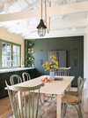
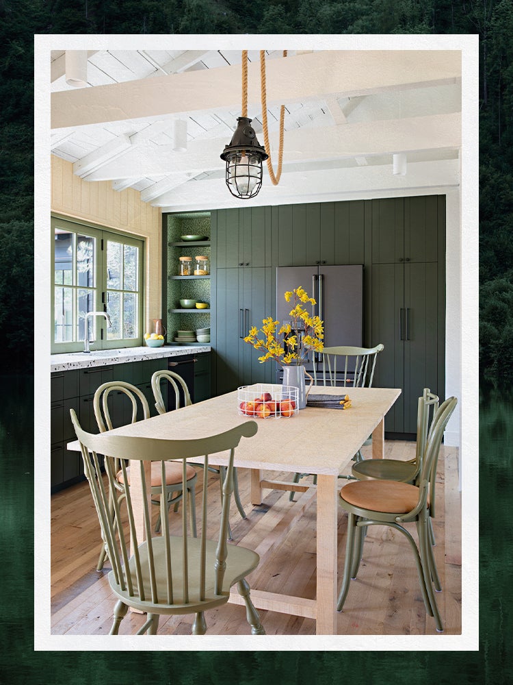
Some of Weisz’s favorite color combinations reference the outdoors, and she often chooses a satin finish for baseboards or millwork for dimension and durability. “We love to mix shades of blue and green with elegant matte brass finishes such as in this kitchen, which features an island in Sherwin-Williams’s Slate Tile, with honey bronze pulls and lighting finishes to pull in warmth and depth,” says Weisz.
Currently Clasen is obsessed with green—whether it’s olive, army, sage, or avocado, it’s her current color of choice. In this kitchen, she paired Ripe Olive (on the cabinetry) and Avocado for the window trim, both in satin. It offers a rich look without being as lustrous as semigloss, and is still strong enough to endure everyday wear, making it a great fit for hallways and kitchens but especially woodwork.
Best Gloss: Fine Paints of Europe

According to designer Andrea Monath Schumacher, nothing beats Fine Paints of Europe when it comes to a gloss finish. “Its pigments are rich and reliable—they never fade,” she says. “The company has gorgeous, quality paint,” Richter agrees. She drenched this entire kitchen in a glossy blue, including the cabinetry and millwork and neighboring dining room “for a smooth, lacquered look.” However, when it comes to this much shine, it’s best left to the professionals. “The light will bounce off any brushstroke or bump, so you need a perfectly sanded and smooth surface,” she advises.
Avery Sefcik of Avery Frank Designs also loves tapping Fine Paints of Europe to dress up dining rooms and smaller spaces like powder rooms or a dramatic foyer. “To me, those rooms can be luxe, dark, elegant, and moody all at once, as it’s not a room you’re in for hours on end,” he says. “So you won’t get tired of a deep, rich, glossy paint as you might in your living room or bedroom.” Bonus: It also gives any artwork a lustrous backdrop.


Other Contenders
Of course, this list isn’t the be-all and end-all of the best paints—it really boils down to personal preference. Here are a few other designer-backed suggestions if you want to widen your palette.
- Flower: Earlier this month, Drew Barrymore launched her first-ever paint line exclusive to Walmart. A bit too new to fully test, two of the 27 unique colors—Toasted Almond and Palm Leaf Green—look fabulous in the celeb’s kitchen renovation.
- PPG: This brand makes Pure White, a staple used by Ford “when going for anything modern and clean,” she says.
- Behr: We trust Behr for the tougher stuff, such as painting decks or staining porches, but have our eye on the company’s 12 new colors in collaboration with Zillow.
Ask Domino
How long does interior paint take to dry?
It really depends on the paint type and the finish. “It takes about 45 minutes to an hour for water-based paint to dry,” offers Boozer, and Schumacher says that the standard best practice is to wait four to six hours before adding another coat. Anything oil-based, she notes, needs a full day. Either way, Lisa Hynes, HW Interiors’s director of operations, says that “it is important to wait for the paint to fully cure before putting the room back into heavy rotation to withstand a busy family. It takes approximately seven days for oil paint and 30 days for latex paint to properly cure.”
Can I use interior paint for painting a patio or deck?
It isn’t a good idea. Interior paint is obviously durable enough to stand up to fingerprints, furniture scratches, or even the humidity of a bathroom, but not outdoor elements like rain or snow, even fading from the sun. The best deck or patio paint is formulated specifically to seep into and protect wood, vinyl, or cement and last season after season. Your interior paint, on the other hand, isn’t built for that kind of wear and tear.
How We Vetted These Products
Every product in a Domino guide meets these criteria:
- They blend form and function. We believe the best-designed products reflect your personal style and are a joy to use.
- They’re expert approved. In addition to our team of editors, we tap a range of designers, makers, renovators, and all-around knowledgeable people to share their intel.
- They’re endorsed by people who actually own them. We pay close attention to real reviews from both our creative community and third-party websites to know that they pass the test IRL.