‘Like a contest entry from a toddler’: David Hockney design for London Underground savaged by public
Simplistic design was shared on social media by London mayor Sadiq Khan

For free real time breaking news alerts sent straight to your inbox sign up to our breaking news emails
Sign up to our free breaking news emails
New artwork created by artist David Hockney for the London Underground has drawn the ire of the general public.
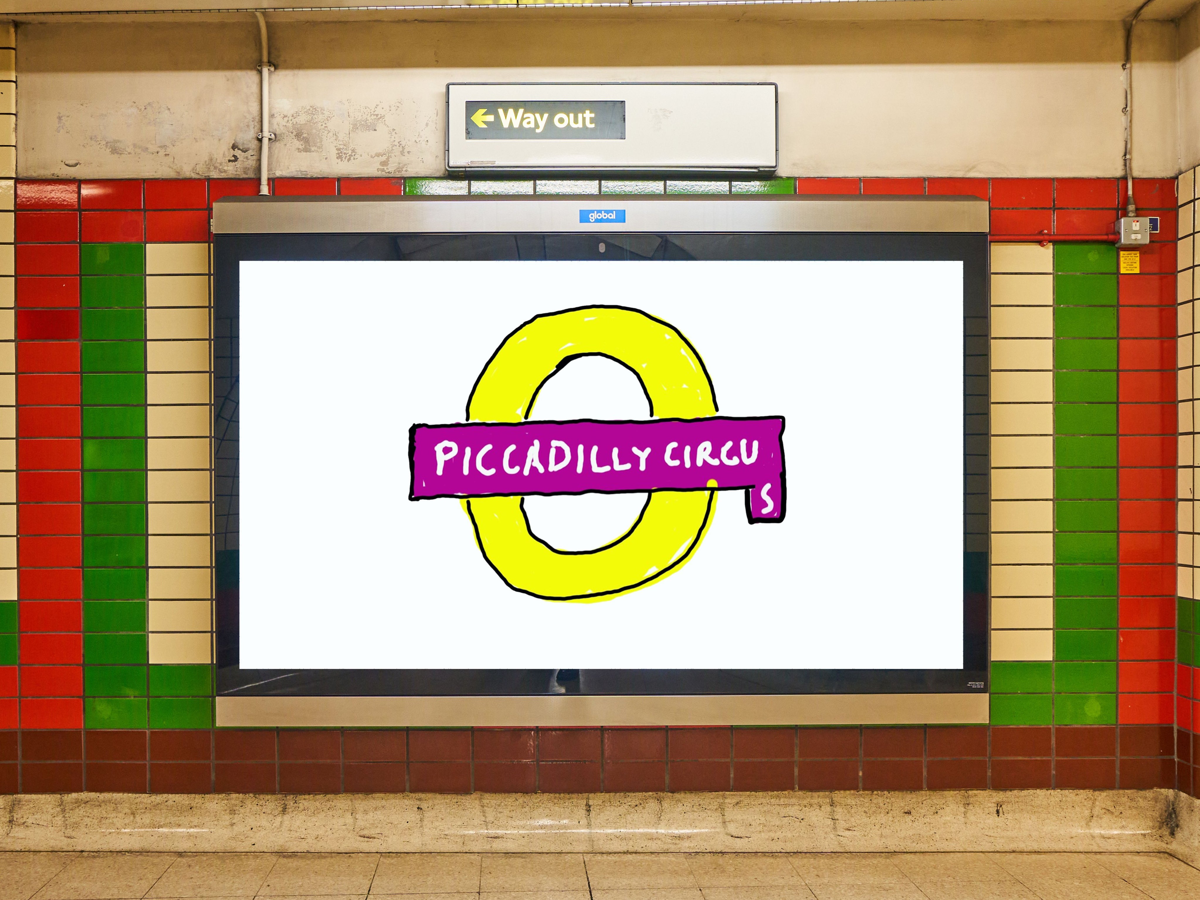
The design was unveiled by London Mayor Sadiq Khan, and features a modified version of the London Underground logo, designed to deliberately appear as if it were crudely drawn using Microsoft Paint.
Khan described the artwork as “brilliant” in a social media post, though many members of the public were quick to disagree.
The piece was commissioned as part of Let’s Do London, a series of major art projects taking place across the UK capital.
It has been confirmed that Hockney did the tube activity completely for free. The design was oriented around a similar theme to his recent Royal Academy exhibition, which the artist has claimed is about hope, Spring and renewal.
As seen in the pictures, the A Bigger Splash artist’s design comprises a digital recreation of the London Underground’s signage for Piccadilly Circus, with the letter “s” added at a tangent, as if the artist hadn’t accounted for how much room the word would take up.
People made their feelings known about the design in the replies underneath, with several sharing their own mock-ups of even cruder designs.
“It looks like the work of a six-year-old who ran out of space due to poor preparation,” wrote one Twitter user. “It looks very unprofessional.”
“That thing in the tube station is indisputably a terrible Microsoft Paint composition,” wrote another. “Even if we accept it’s meant to be ironic, it’s still awful to look at.”
One person described it as looking “like a contest entry from a toddler”, while yet another amusedly accused Hockney of “trolling the world”.
“Hideous, puerile work, awful colours in its setting of red and green tiles,” wrote someone else.
Others, however, thought the design was a successful piece of humorous art, with one person even describing it as “beautiful”.
Subscribe to Independent Premium to bookmark this article
Want to bookmark your favourite articles and stories to read or reference later? Start your Independent Premium subscription today.
Join our commenting forum
Join thought-provoking conversations, follow other Independent readers and see their replies